Feugiat Lorem
Lorem ipsum dolor amet, consectetur magna etiam elit. Etiam sed ultrices.
The goal was to show on the screens on the outside of the installation what the emotion was of the user of the chatbot at the inside of the installation.
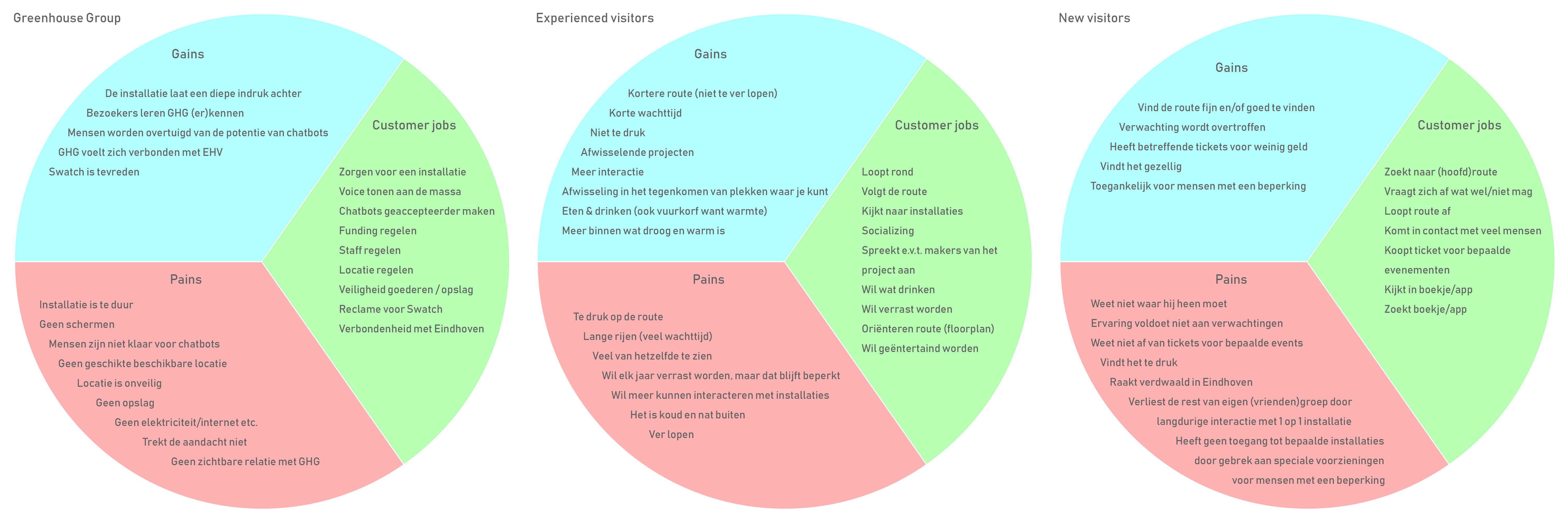
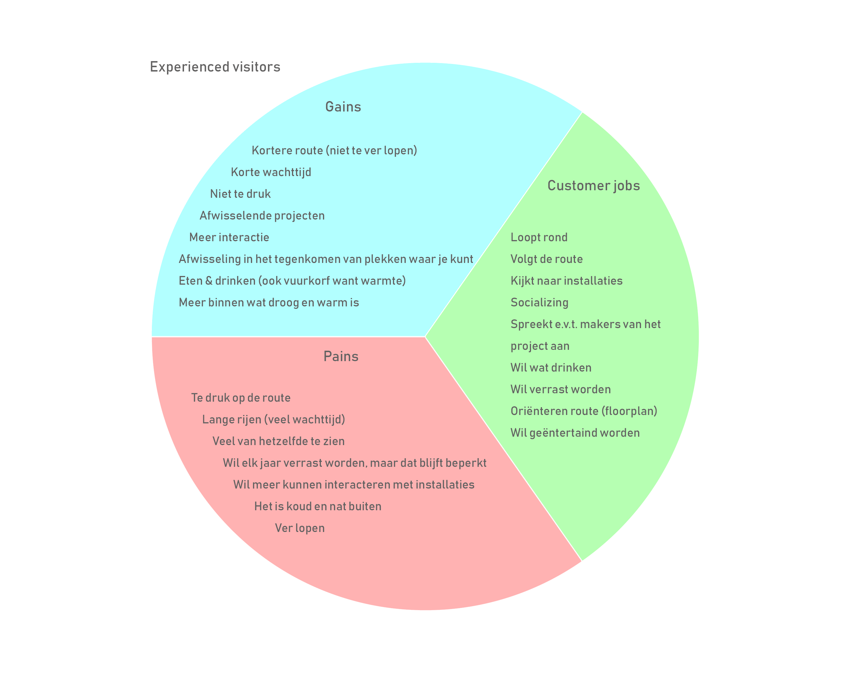
To understand the purpose of the Glowie project, and to get an impression of the stakeholders and the target audience, we made a ‘situation and complication’ analysis. Based on that, we determined the pains and gains of three separate groups; the target audience, Greenhouse Group as a whole, and the stakeholders. The target group of Glow is an international audience, frequent visitors and new visitors of Glow. The stakeholders besides Greenhouse Group itself are Stakeholder X and Sahara. Stakeholder X is involved with the designs, and Sahara is the provider of the screens.
As a result, we produced these analyses;
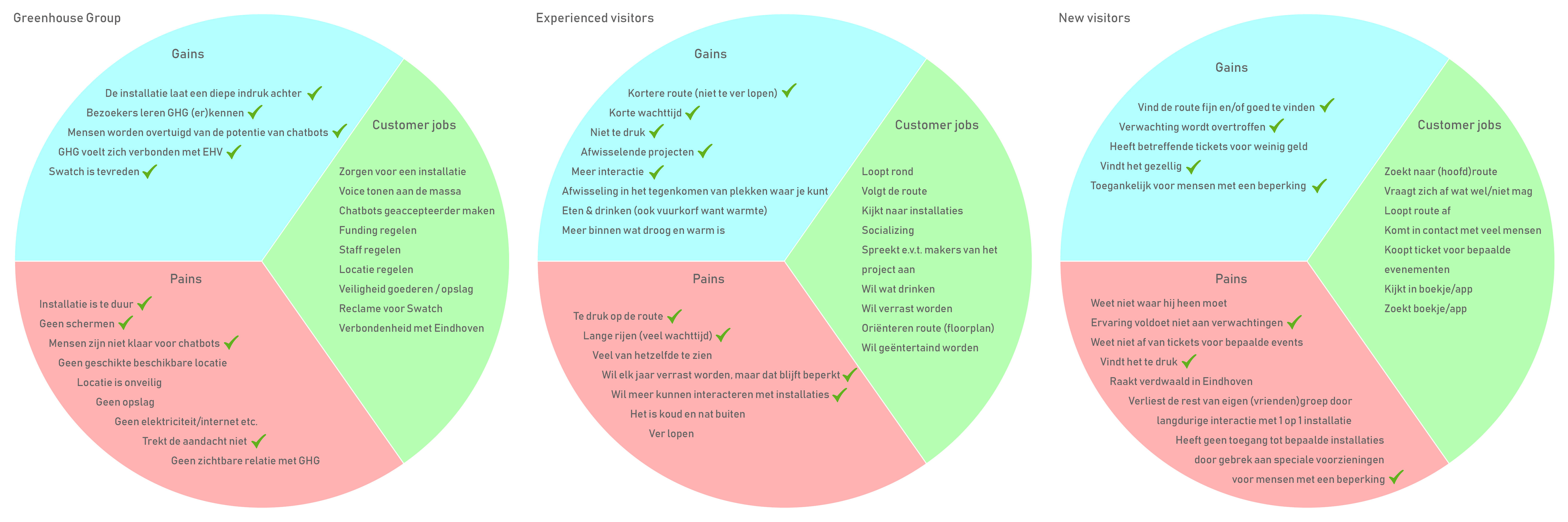
To validate the assumptions of the pains and gains, I worked out a questionnaire for the new- and frequent Glow-visitors. I combined the questions in one Google Form, which got 80 respondents. In this excel sheet is shown what answers are given. This validates a lot of assumptions. What assumptions are validated, is shown in this document.
I've interviewed one of the 3 involved members of the Greenhouse Group, to get familiar with their interests with sight of the company. This form of interview was face-to-face. The results of the person who I interviewed are visible in this research document.
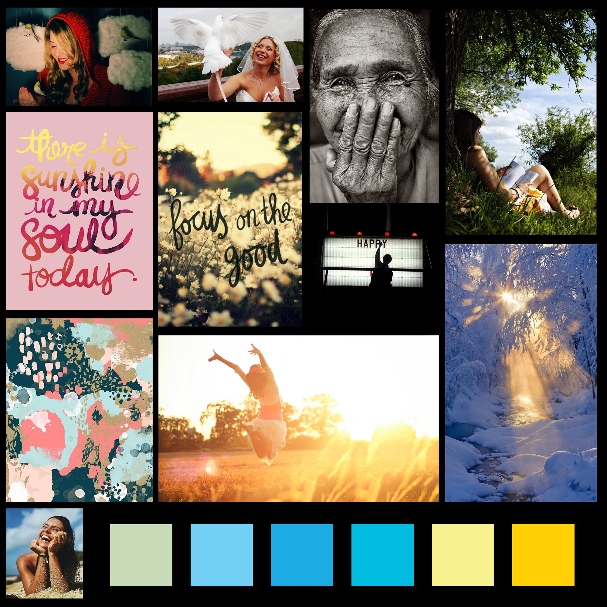
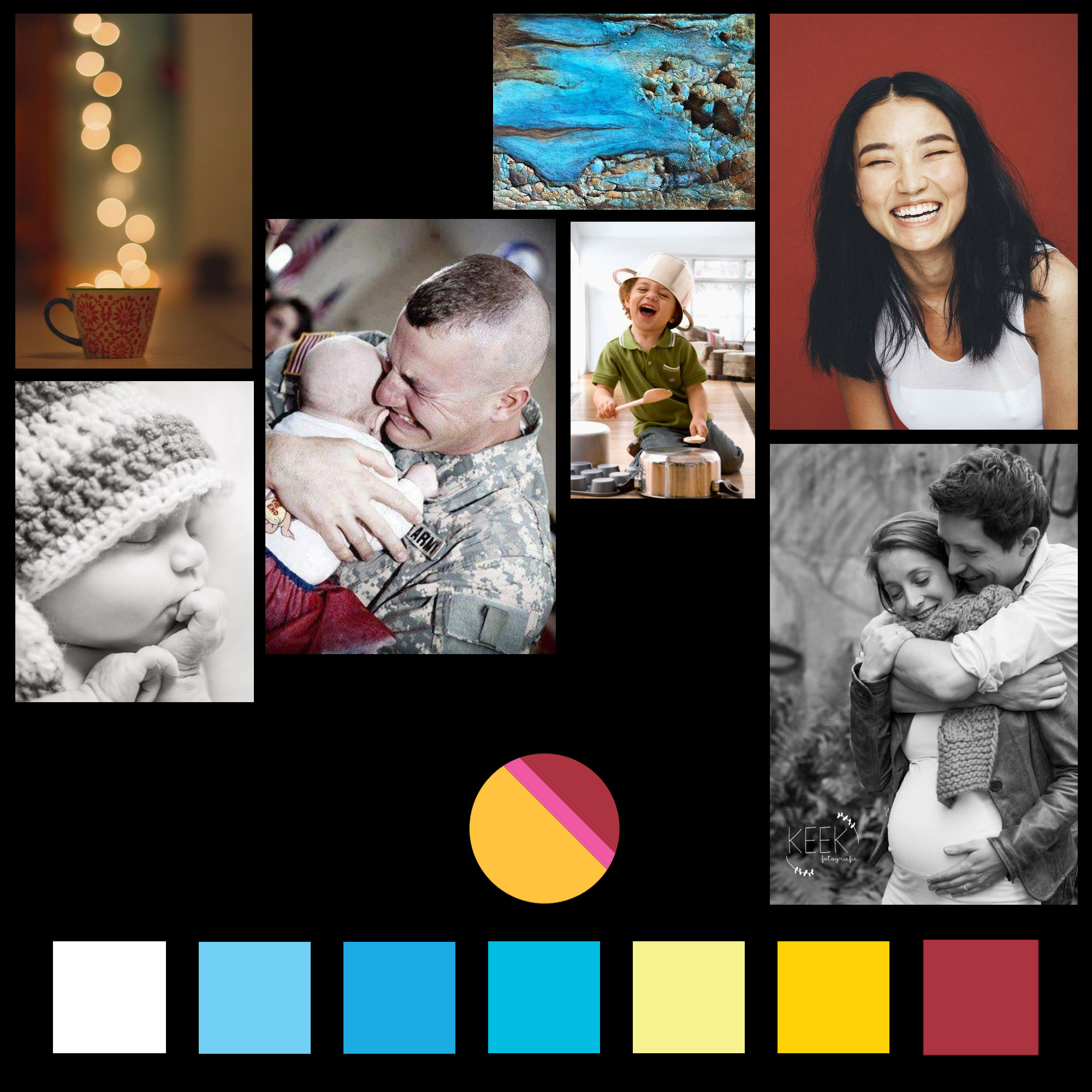
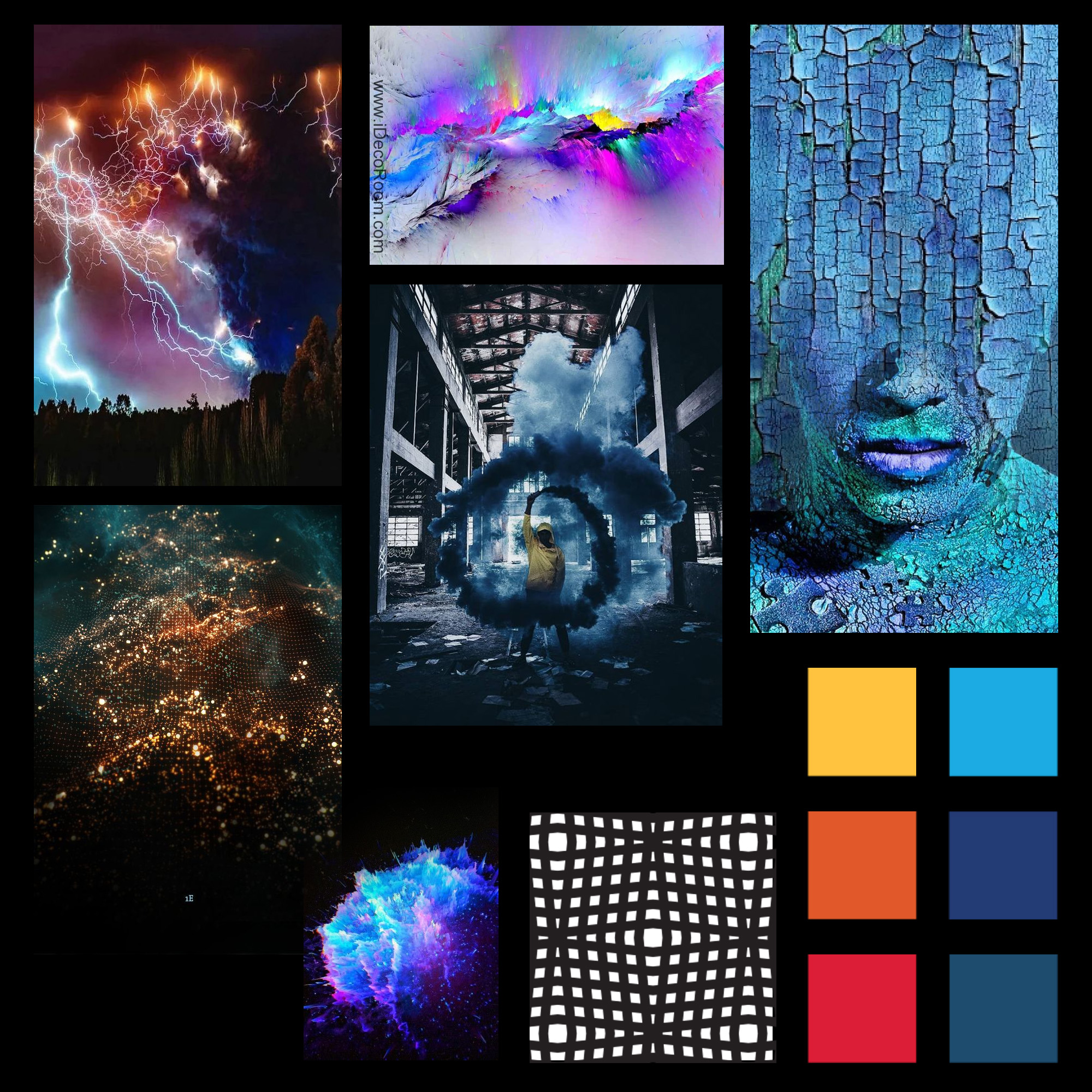
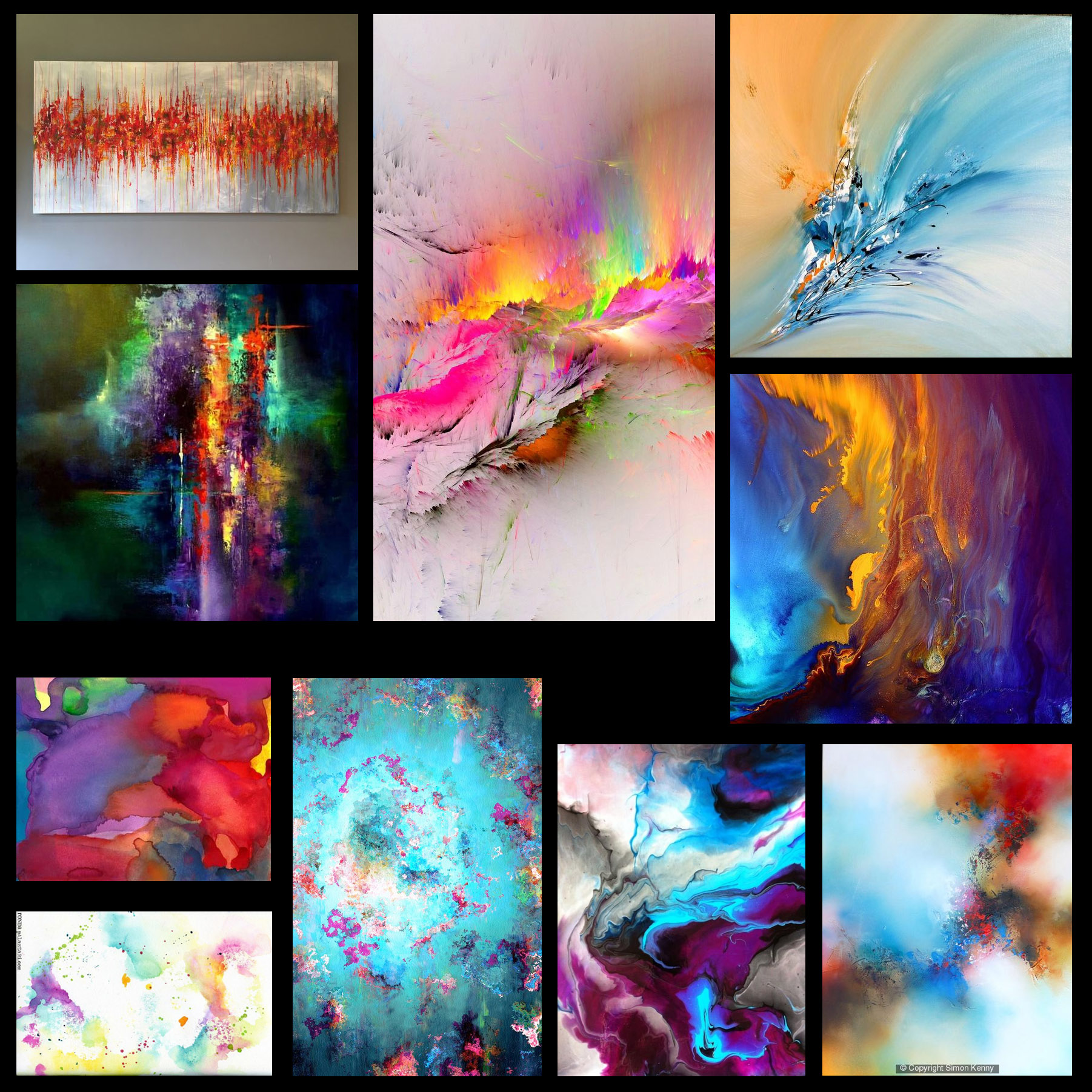
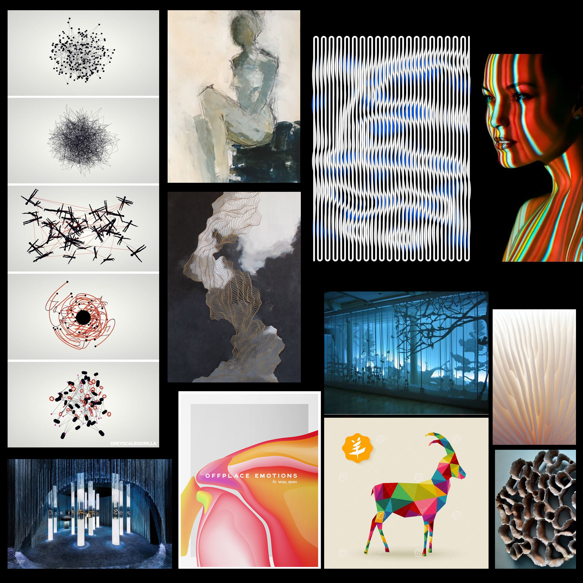
To get inspired by Pinterest and getting familiar with this subject about representing emotions in a visual way, I made moodboards for the happy-emotion and expressions. The target was not set to make visuals based on these moodboards, but it should set an atmosphere and could give inspiration. This is the result;
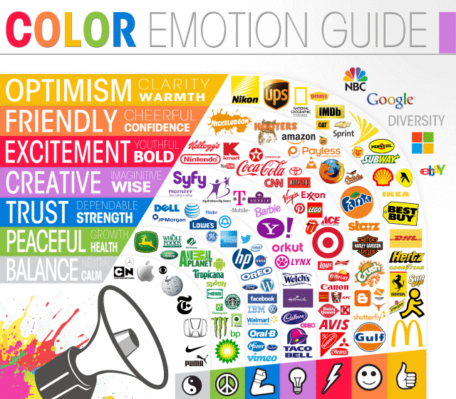
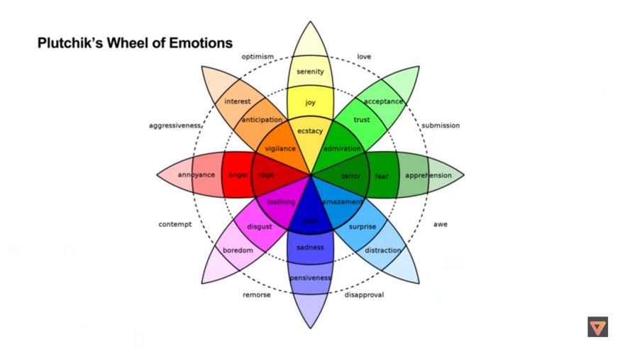
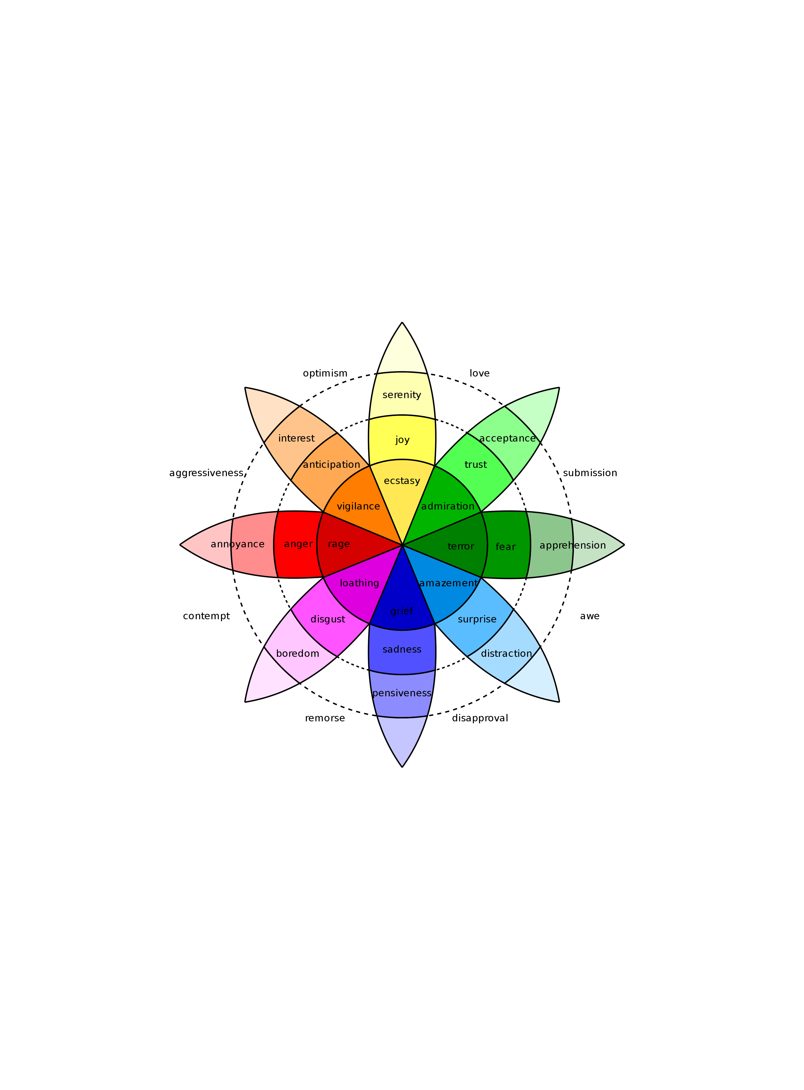
After the questionnaires and interviews I’ve researched the use of color in the field of emotions and which color represents a specific emotion. To form which colors represents the emotions, there was research needed about the use of color per emotion stadium needed. I’ve found the wheel of emotions, a visualization of colors what brands use to give customers an association with a feeling and lots of similar visualizations. In the end I chose to use the wheel of emotion as fundamental base, because this covers the wide field of emotions in a very clear way.
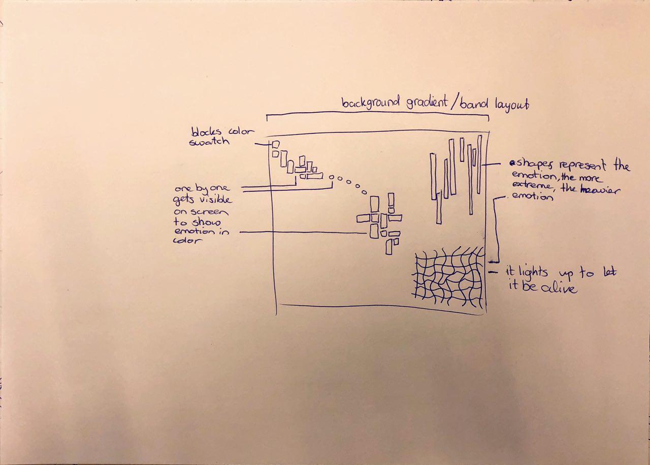
I based further progress on the wheel of emotions, which was visualized with colors and the concerning emotions. The colors and shapes of Stakeholder X were needed to visualize the emotions as well a style-guide for me and the senior-designer, which I created based on the research and Stakeholder X elements. After having user tests about visuals and shapes which represents possible emotions, I made another style-guide, which includes these shapes and patterns, fundamental for the motion-designs what the senior-designer will design.
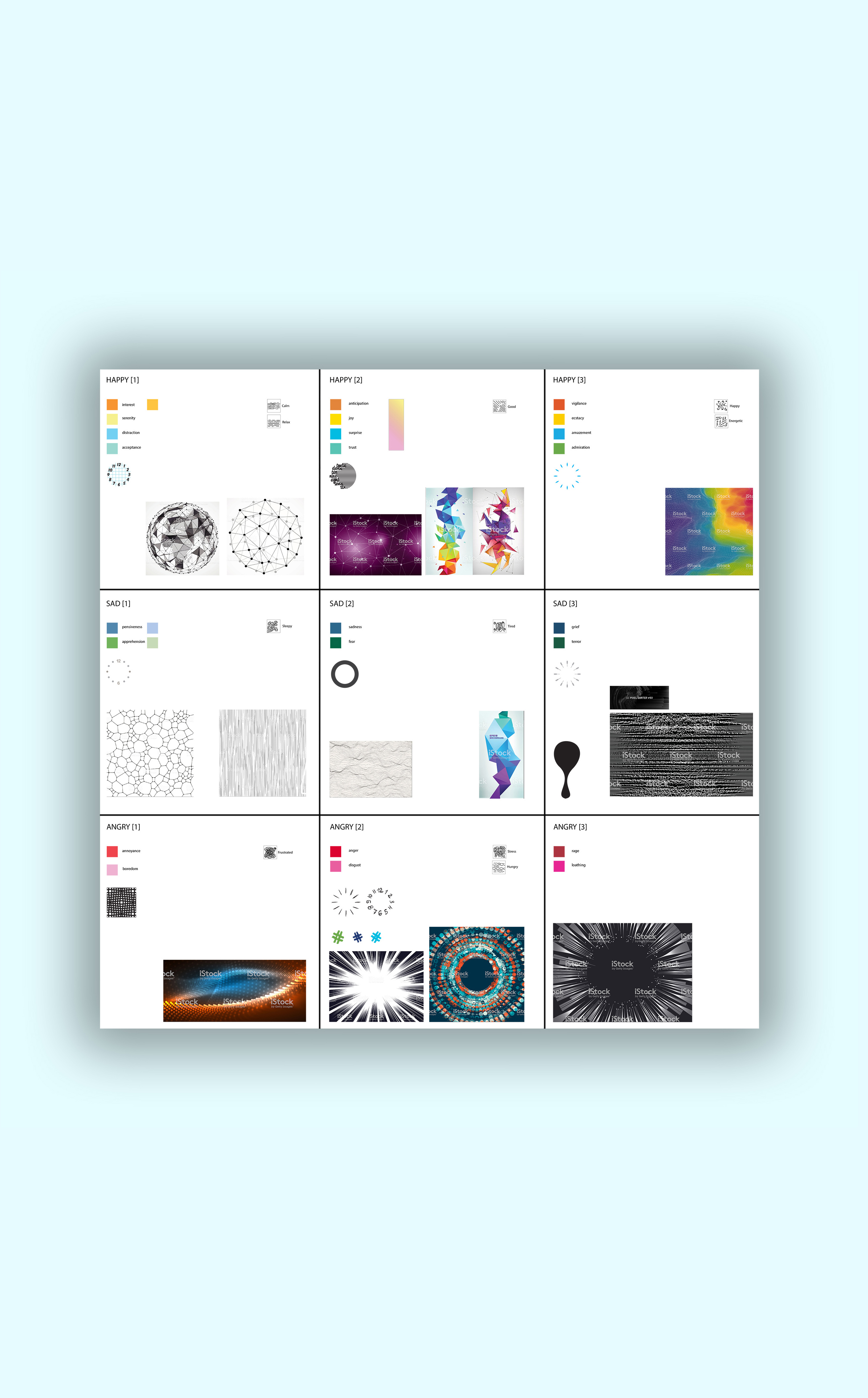
To form ideas for abstract motion-designs, I did do research to shapes representing emotions. I noticed that there isn’t much available work on this subject. This is the outcome. Because of a lack of information about this subject, I started to collect images with patterns on iStock.com in this document.
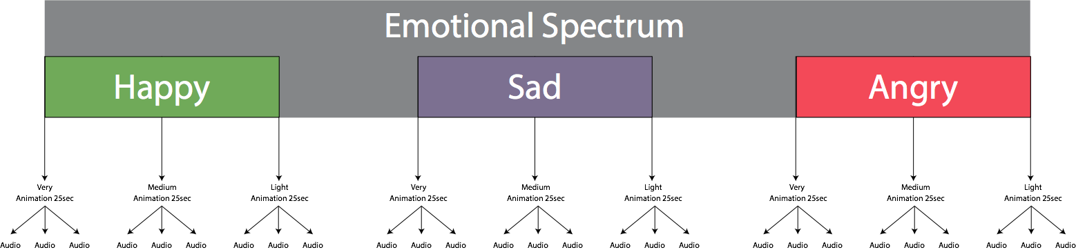
The list of emotions was an essential part and of huge need to the copywriters and the software-writer of the chatbot. Important was, that all the emotions would be divided onto Happy, Sad and Angry. Every main-category had 3 levels; light, medium and heavy. The divided emotions are visible in this excel sheet. In the end, the whole team decided to skip the weight, because of complexity of having too many layers in emotions.
To research and validate assumptions, I created user tests and carried out in 2 iterations. These assumptions were my opinion as a designer, which needed to be verified by the target group.
The first user test was to give direction to form abstract patterns for visualization of an emotion. There were 3 main emotion layers, which were happy, sad and angry. I decided to keep the visuals that got a unanimous result for further development and research. This small user test got 10 respondents.
The second iteration of user tests included the designs which the senior-designer has made, based on the outcome of my user test. The result of these user tests would show what kind of emotion people think it could fit on the motion-designs. I chose to make screenshots of these visuals, because the visuals were not to be revealed at this point. I asked questions about which emotion would fit these visuals and the reason why the respondents thought so.
With the results of both user tests, which is combined in this excel sheet (Dutch), I was able to show the senior-designer based on research what emotions fits on these designs.
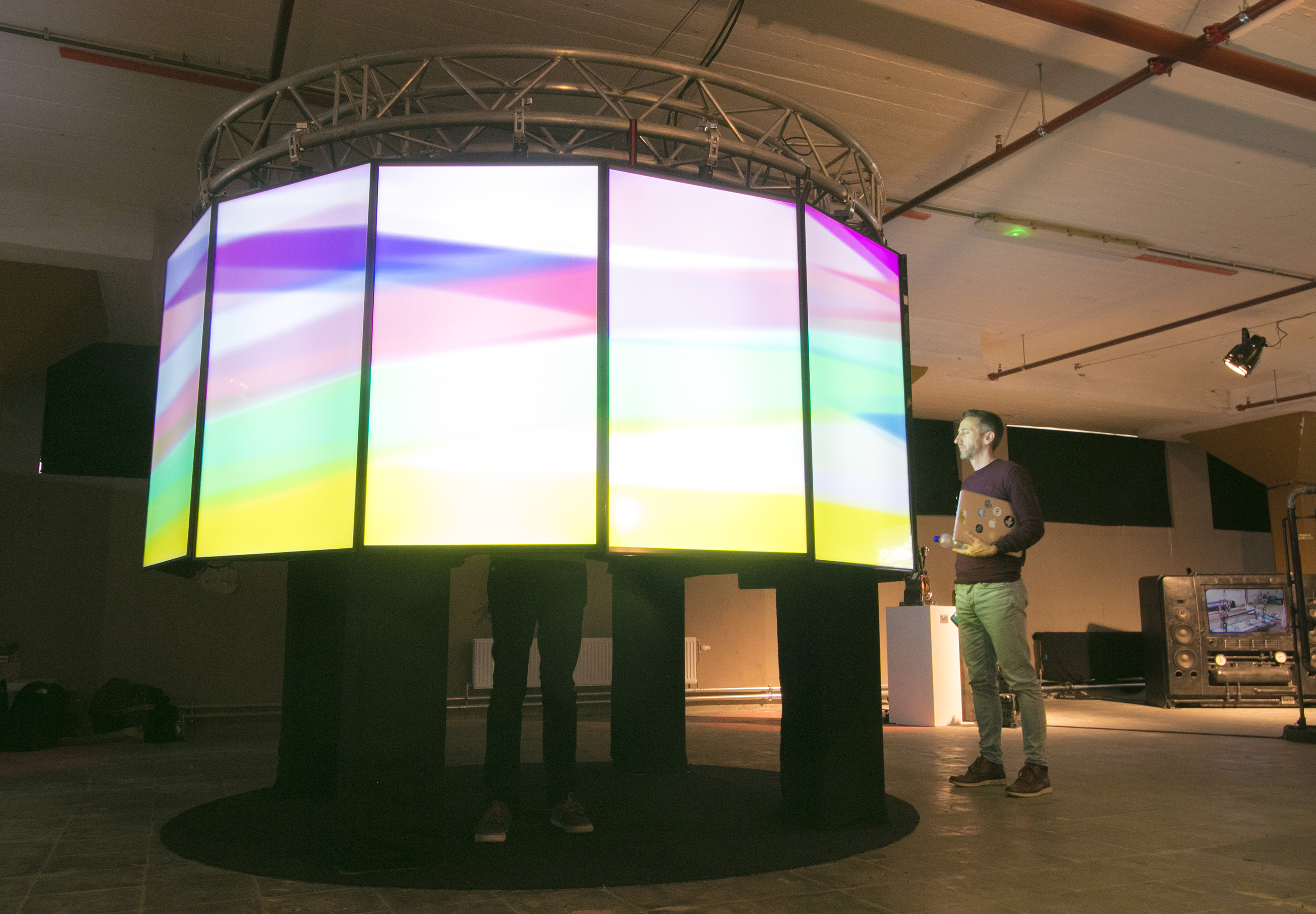
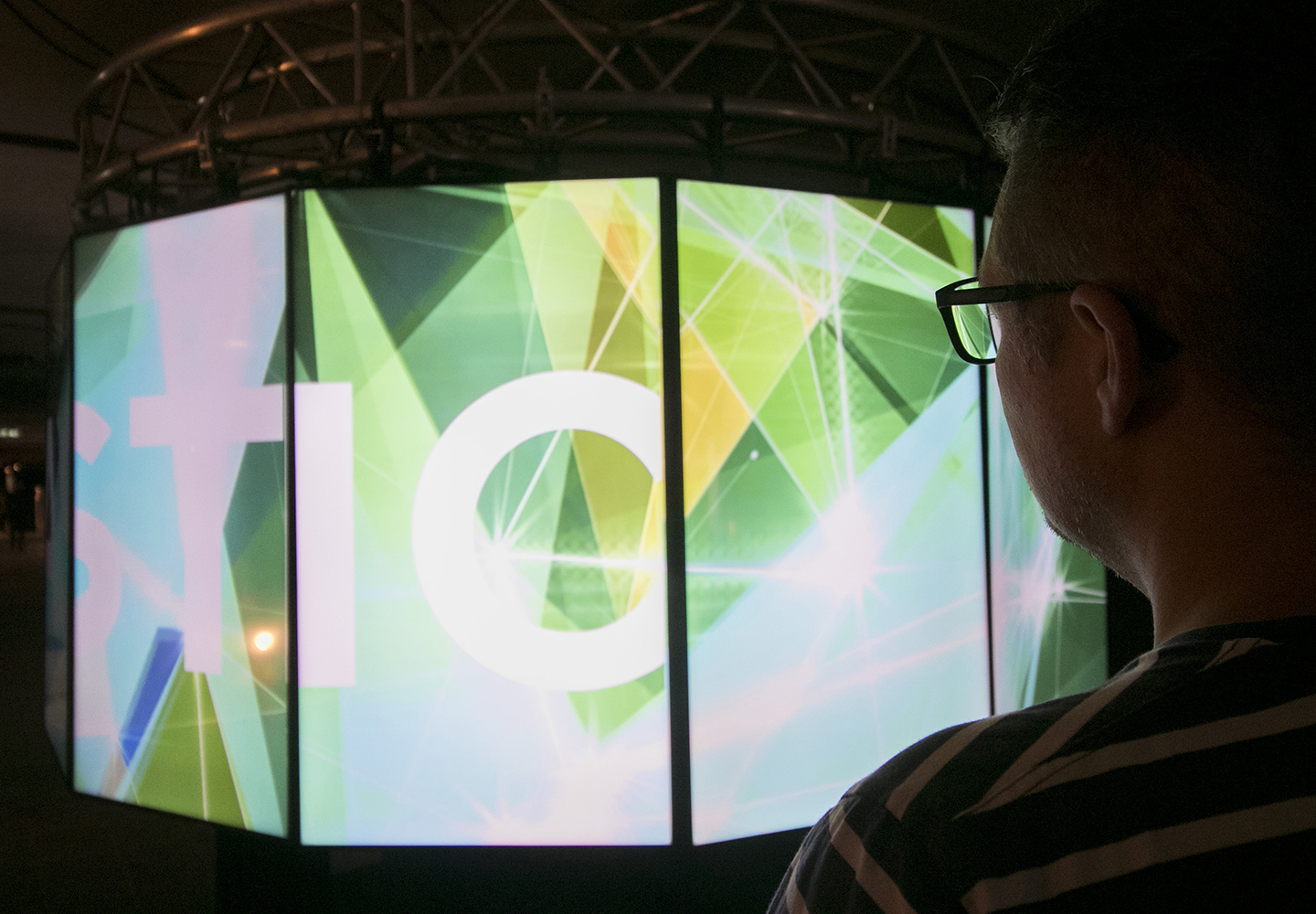
Once the senior-designer got the style-guides, he was able to build motion-designs in After Effects. From time to time during this process I gave feedback on his work. Before researching how colors and shapes relate to the spectrum of emotions, I made a mock-up in Illustrator for a motion-design based on a sketch. The senior-designer transformed this mock-up in After-Effects to a first motion-design. This design was needed for Stakeholder X. A couple of weeks later, during the Dutch Design Week, huge changes based on the opinion of Stakeholder X were needed, which made previous research un-used. The final motion-designs based on these changes were shown at the Glow event.
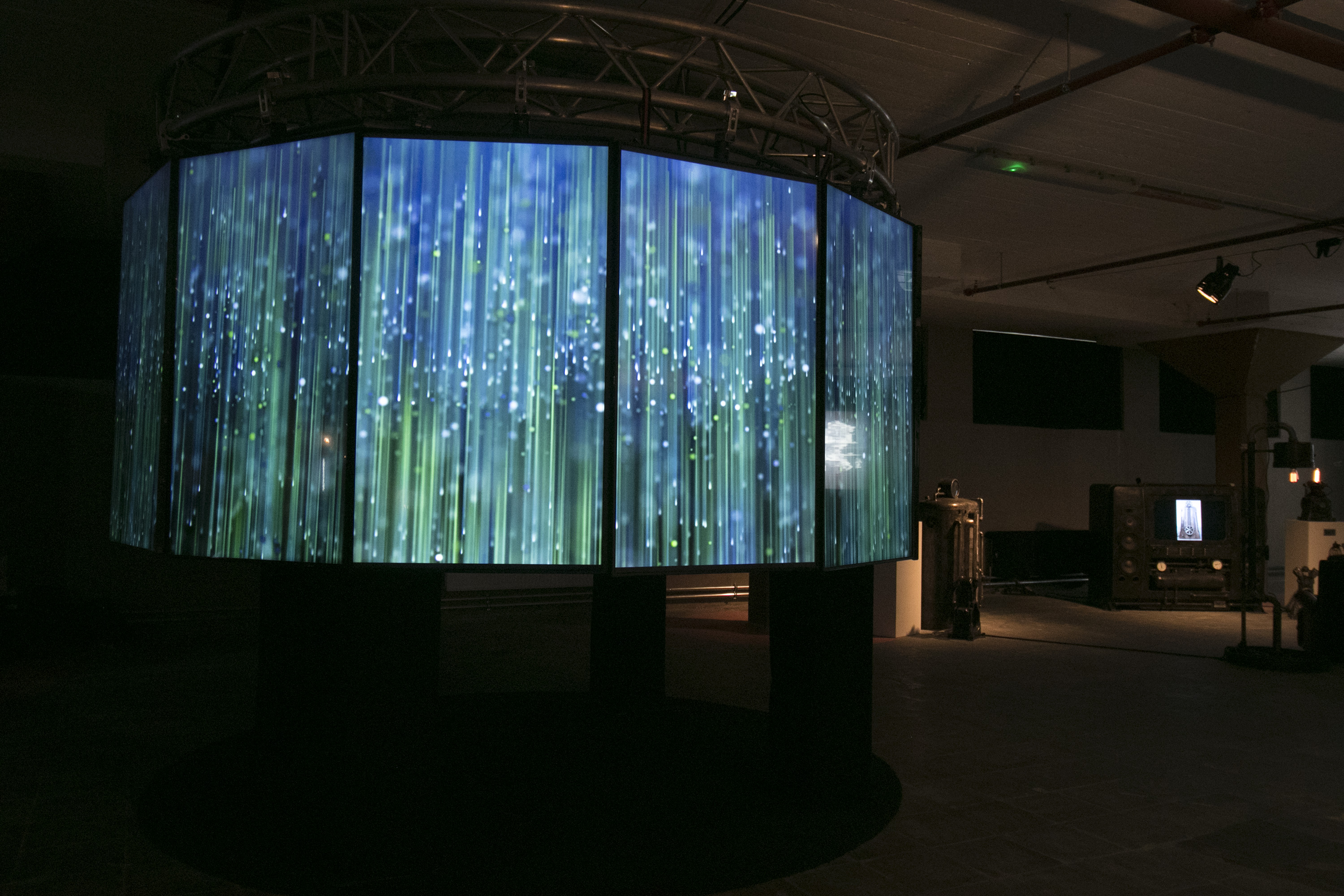
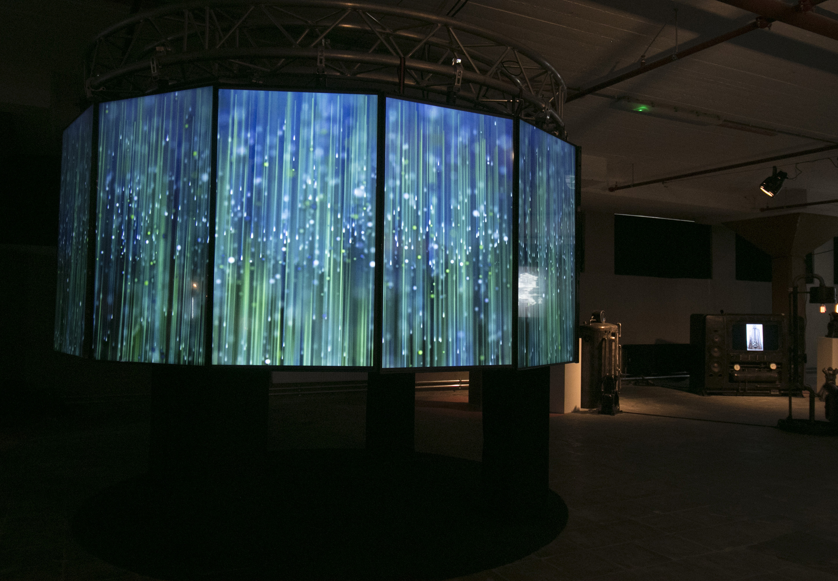
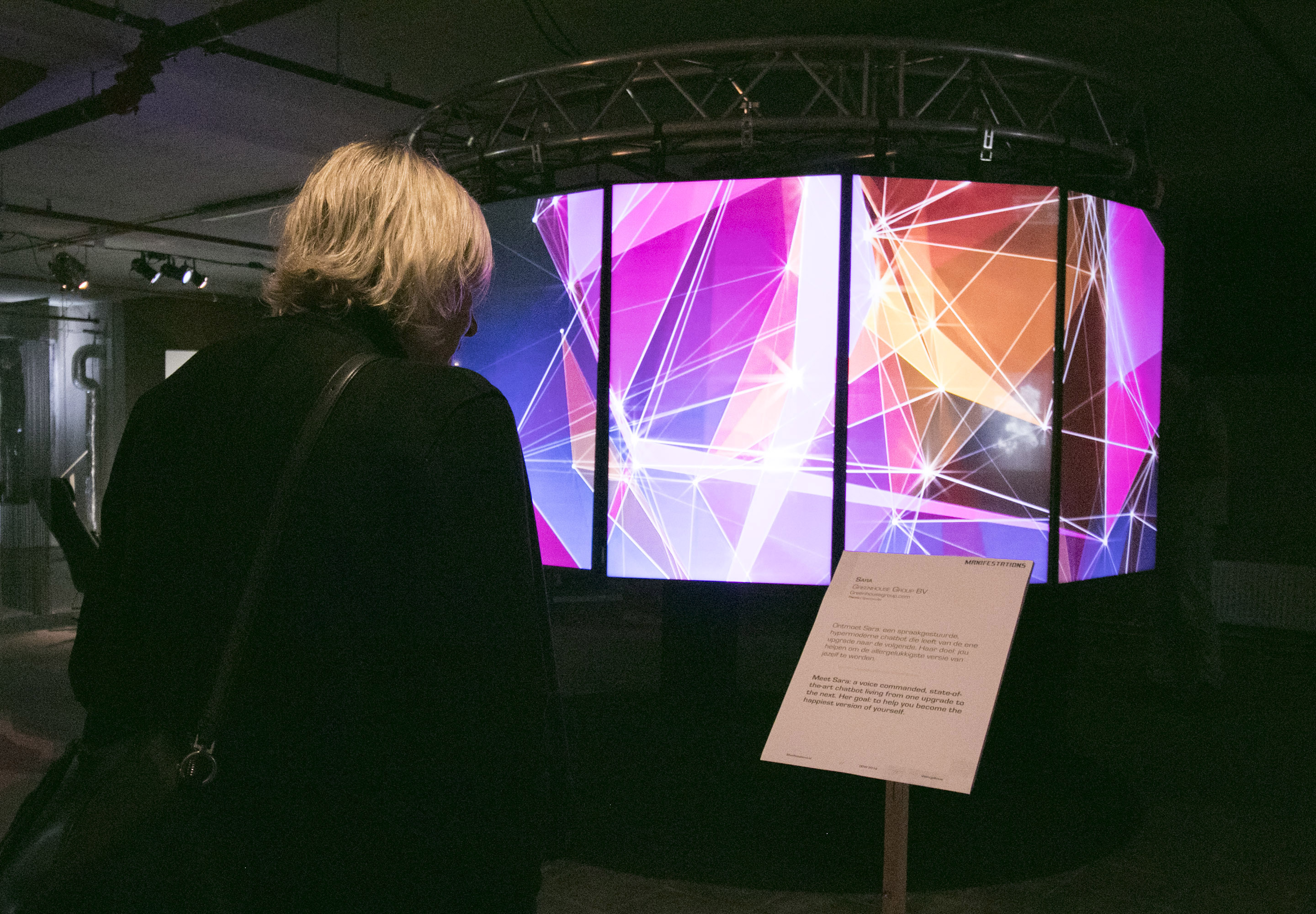
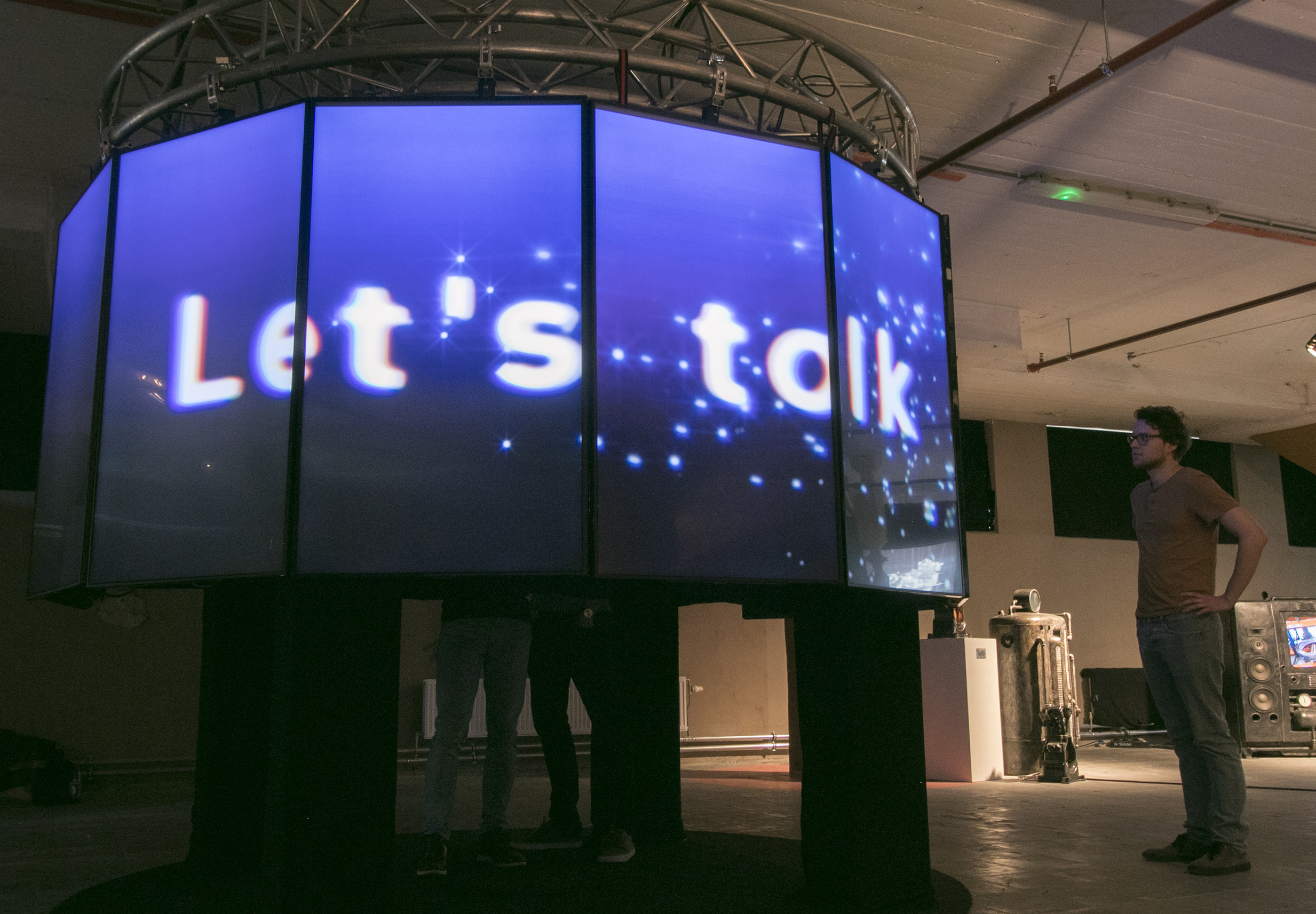
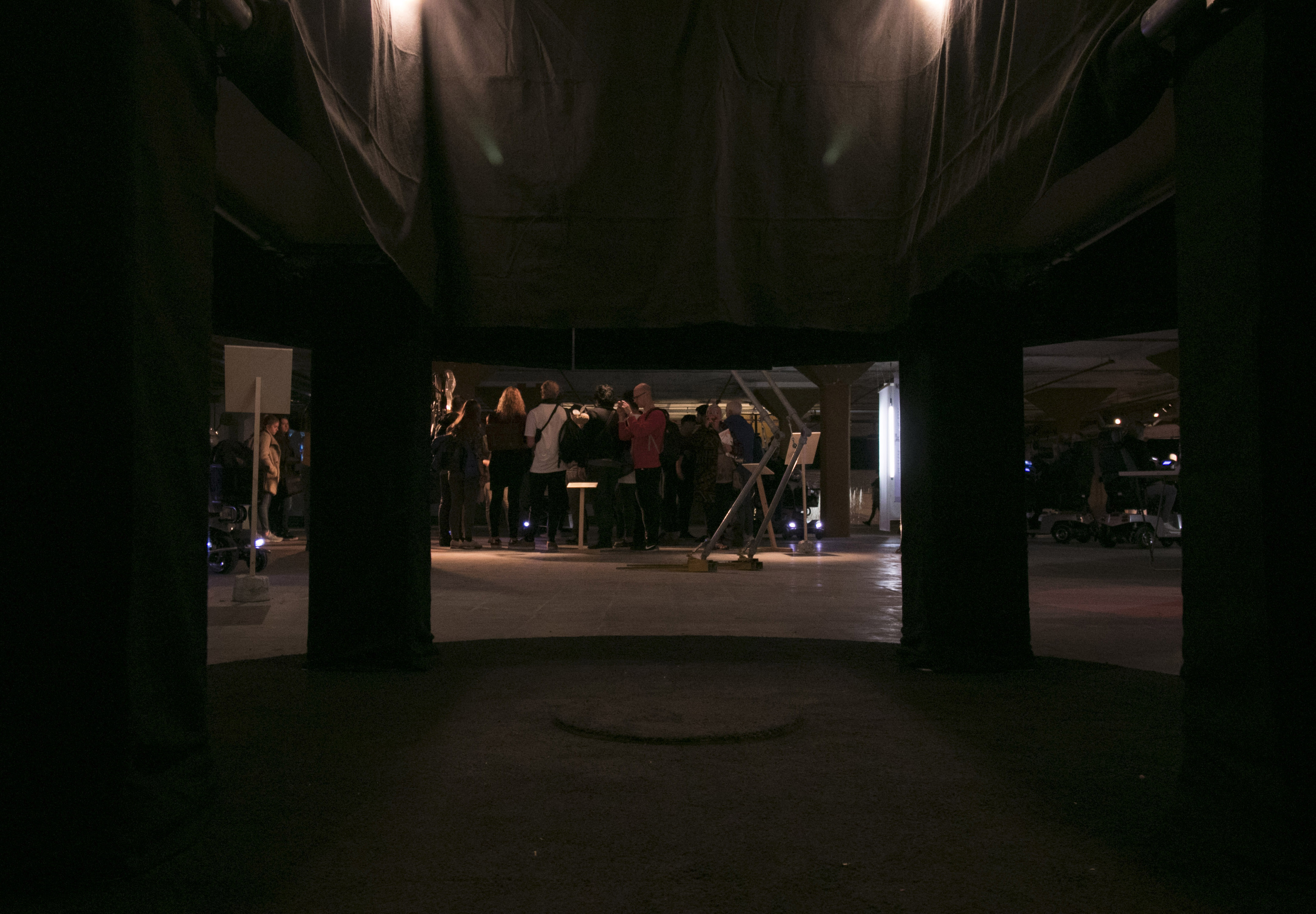
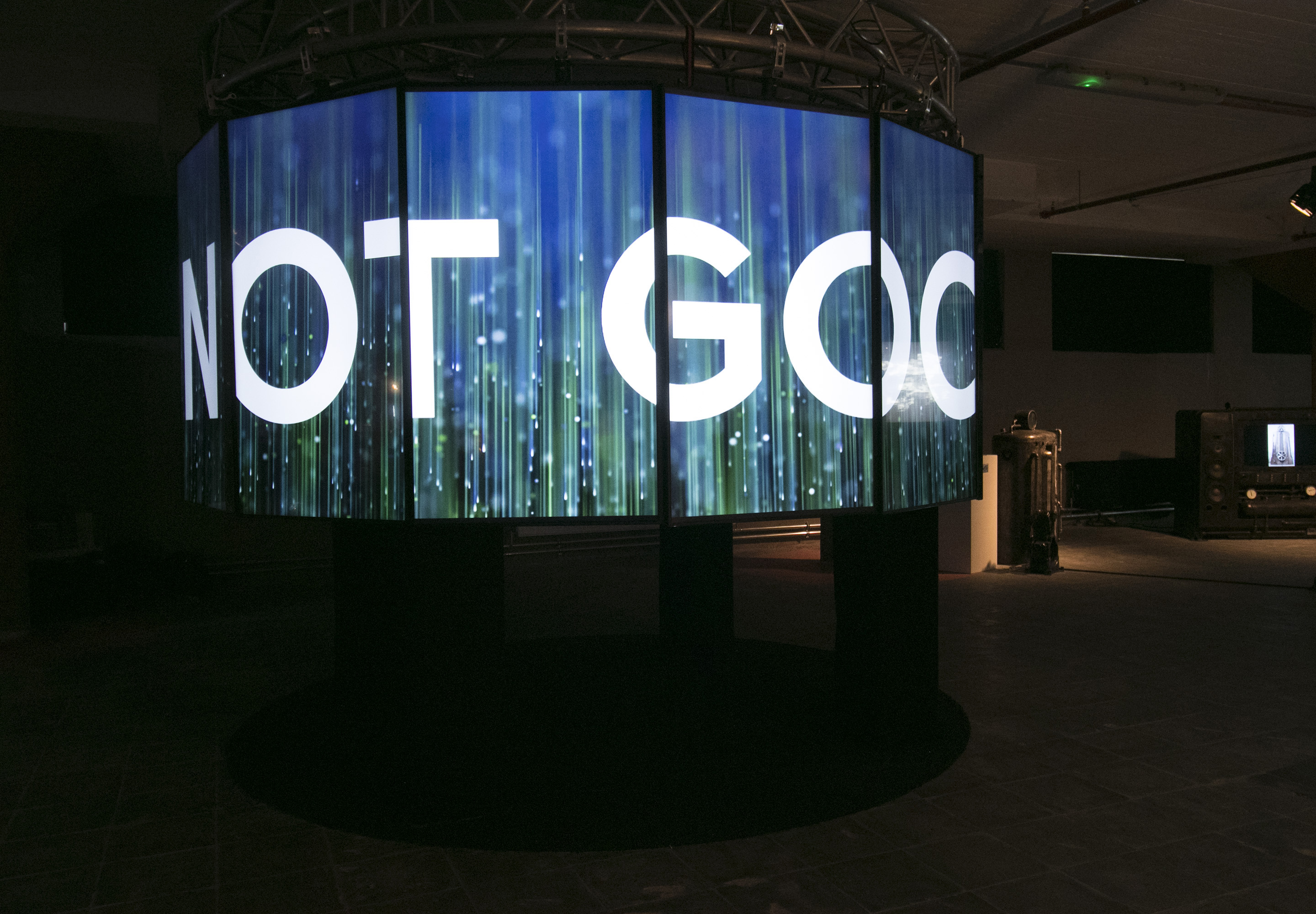
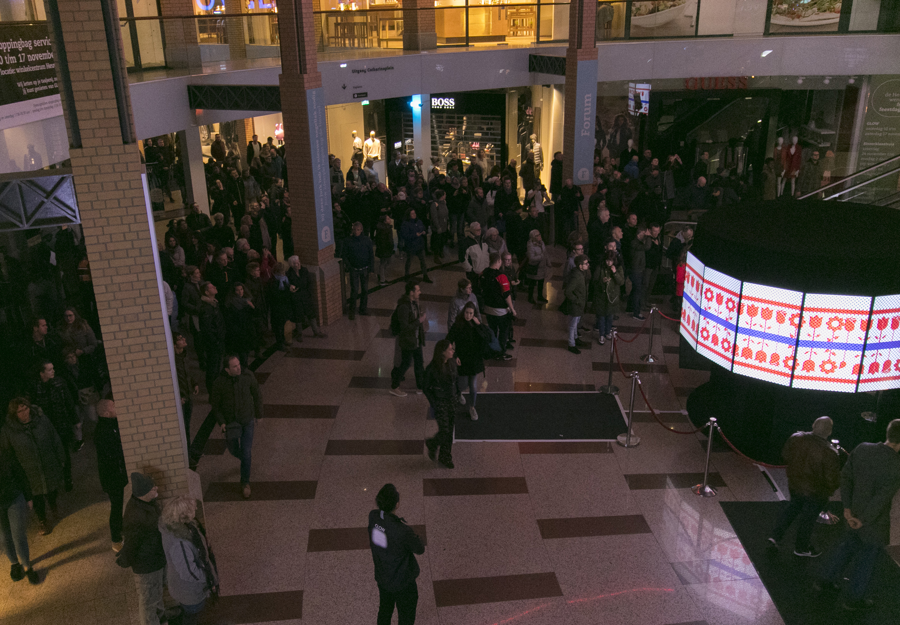
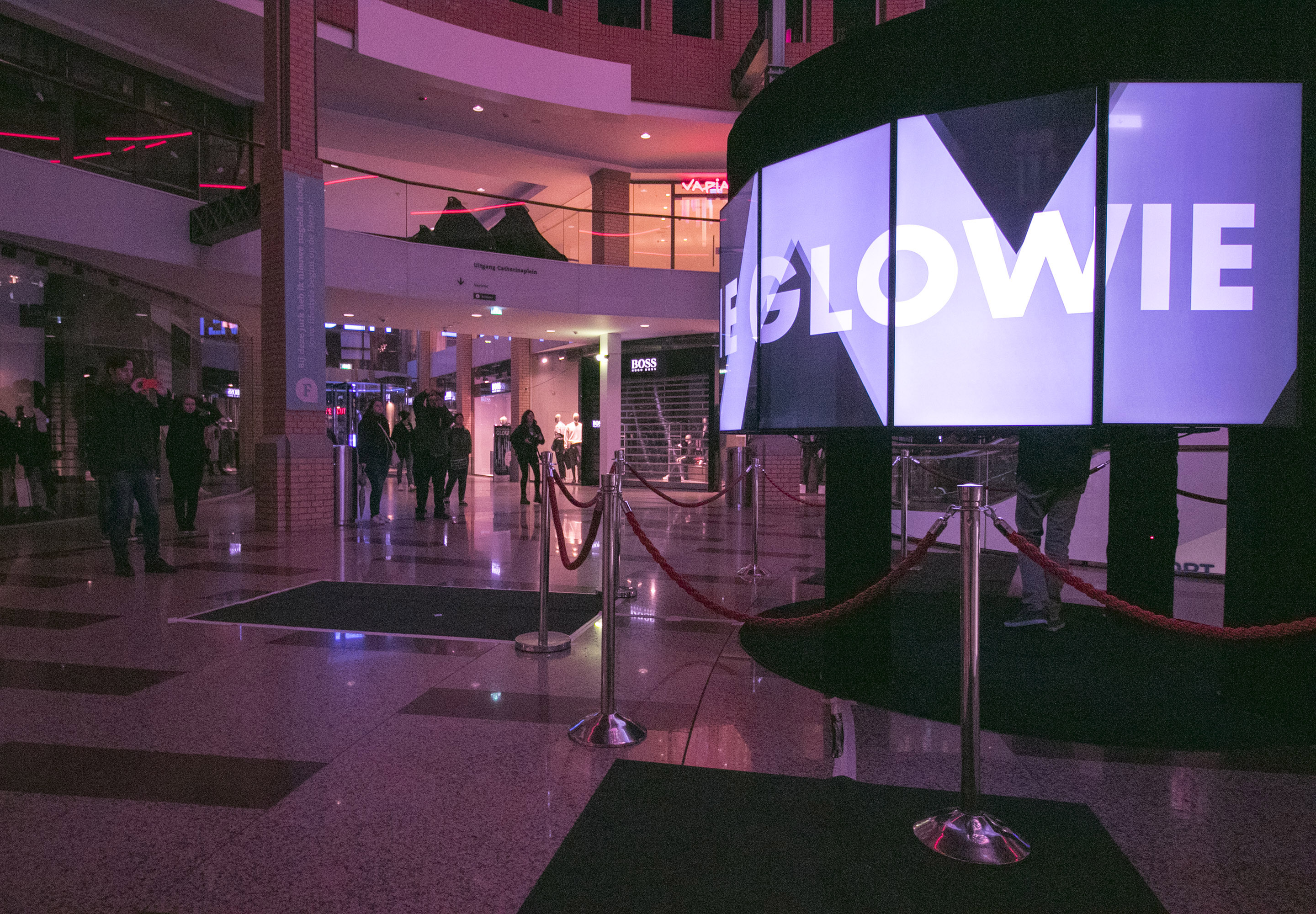
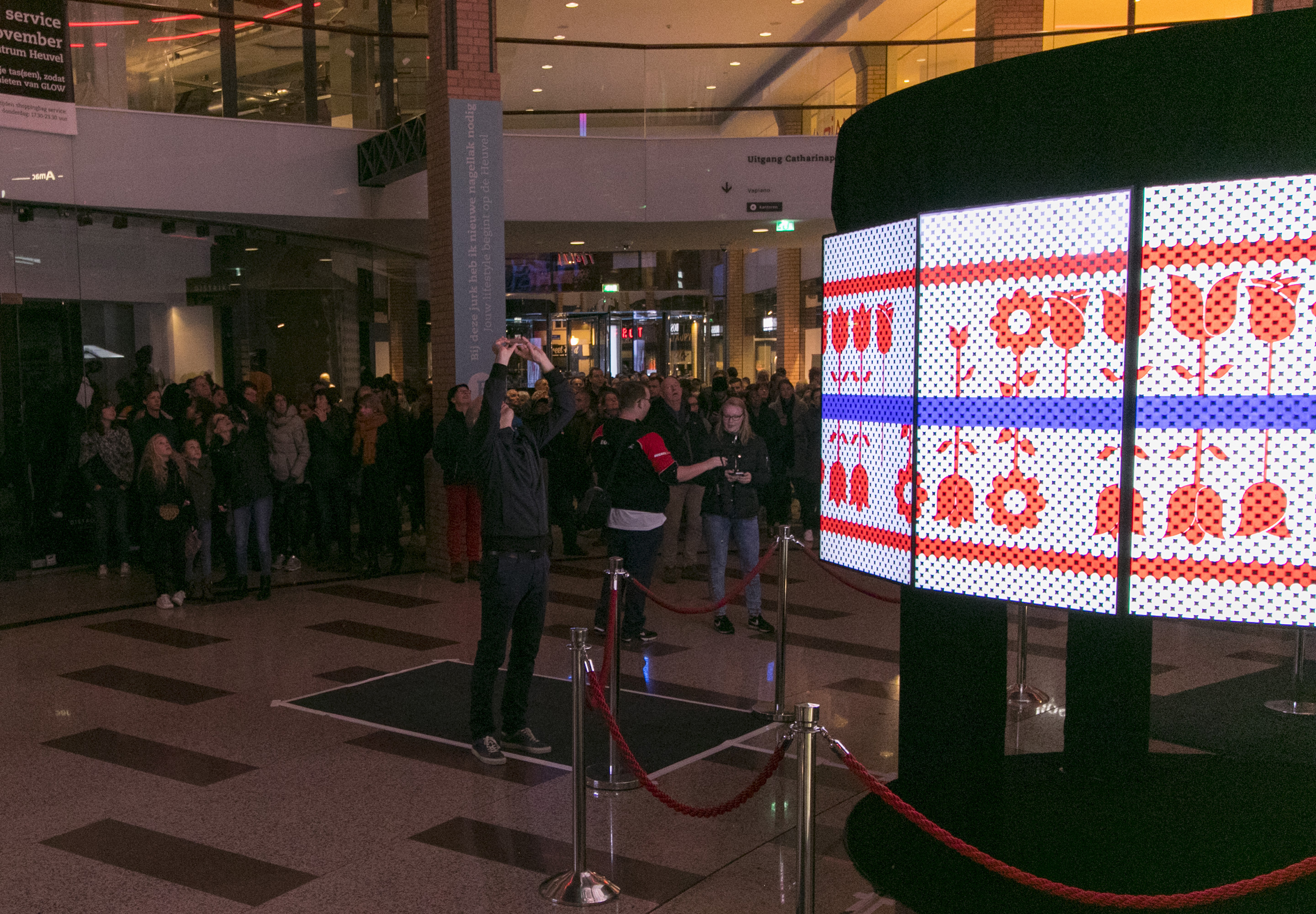
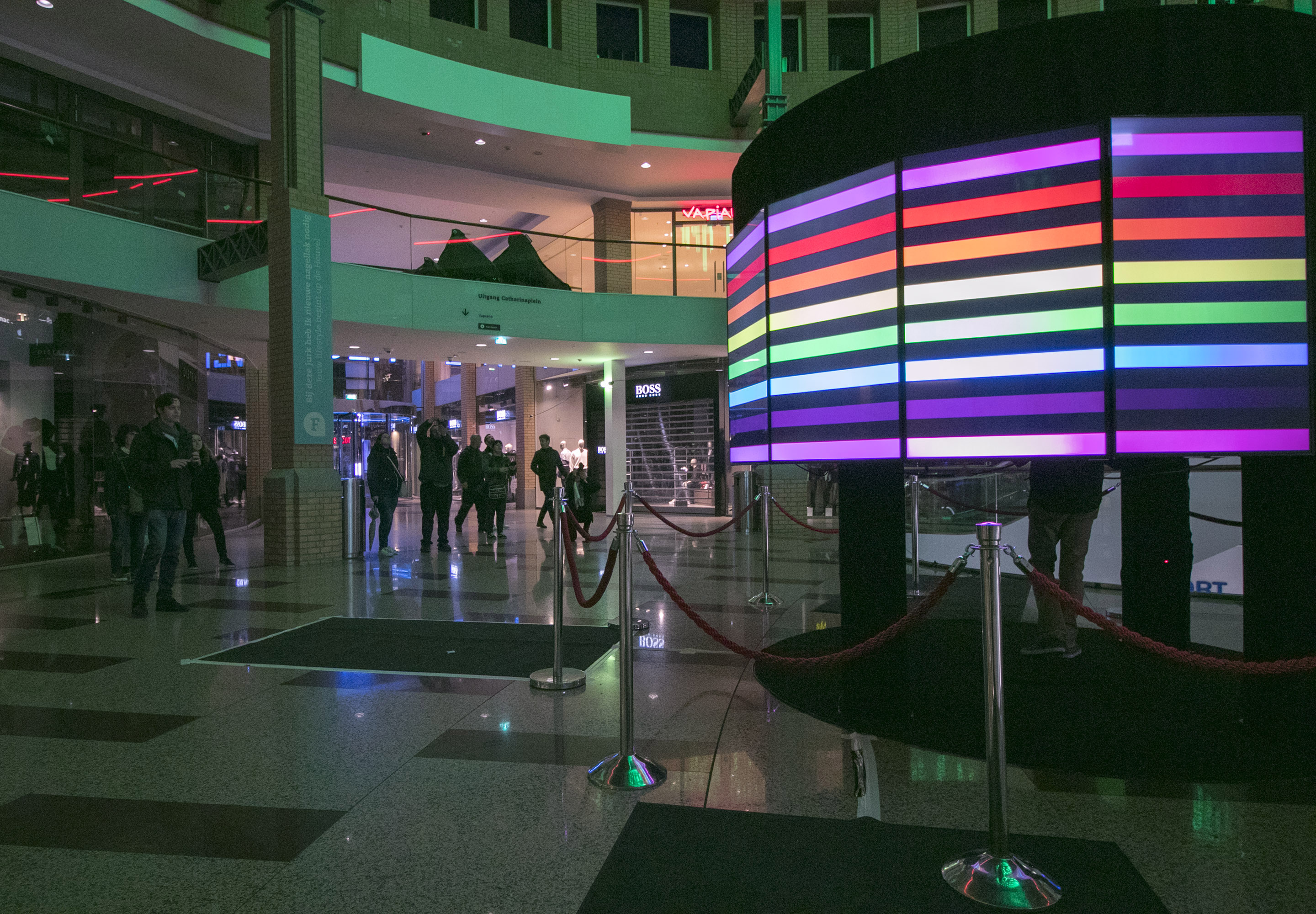
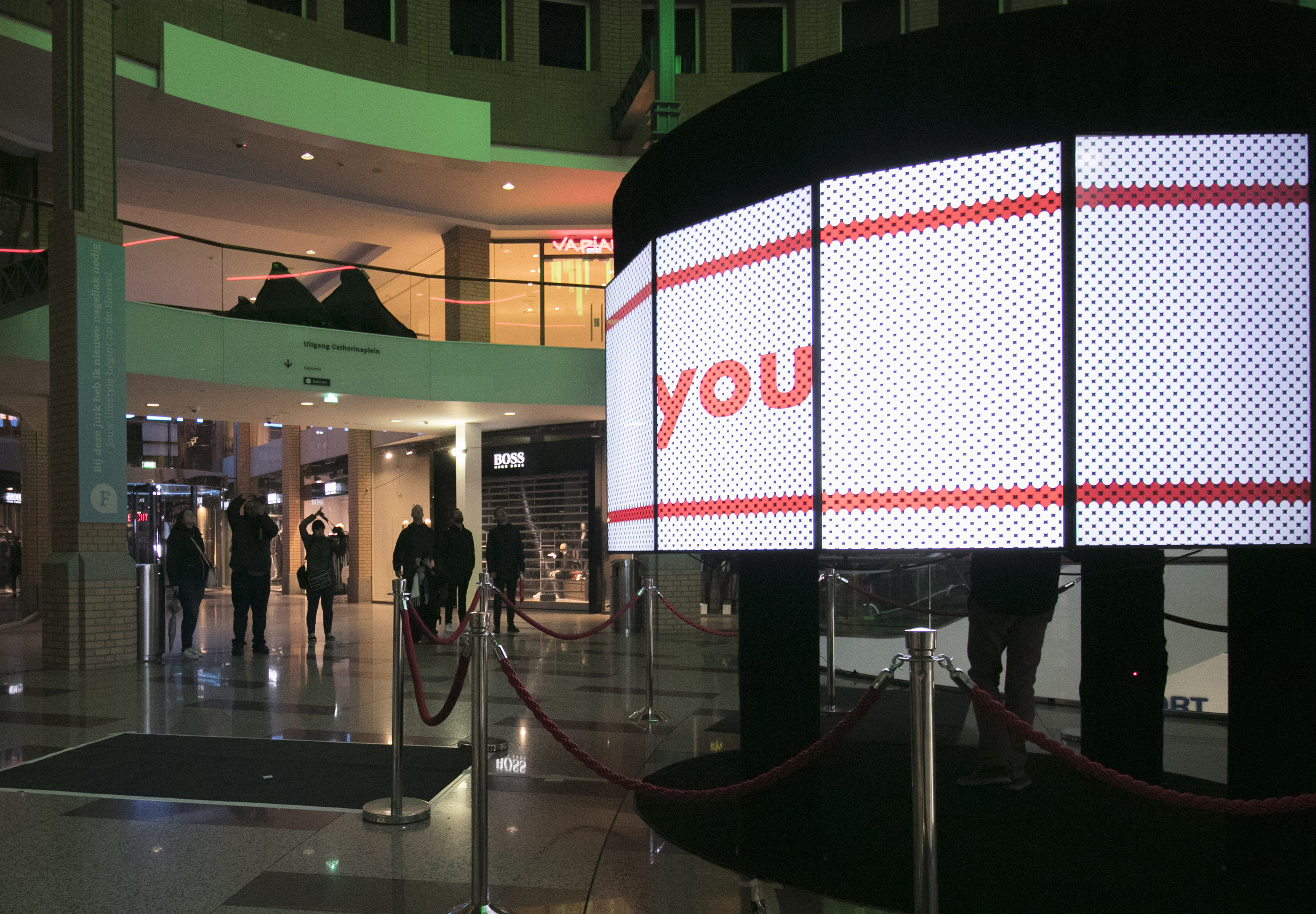
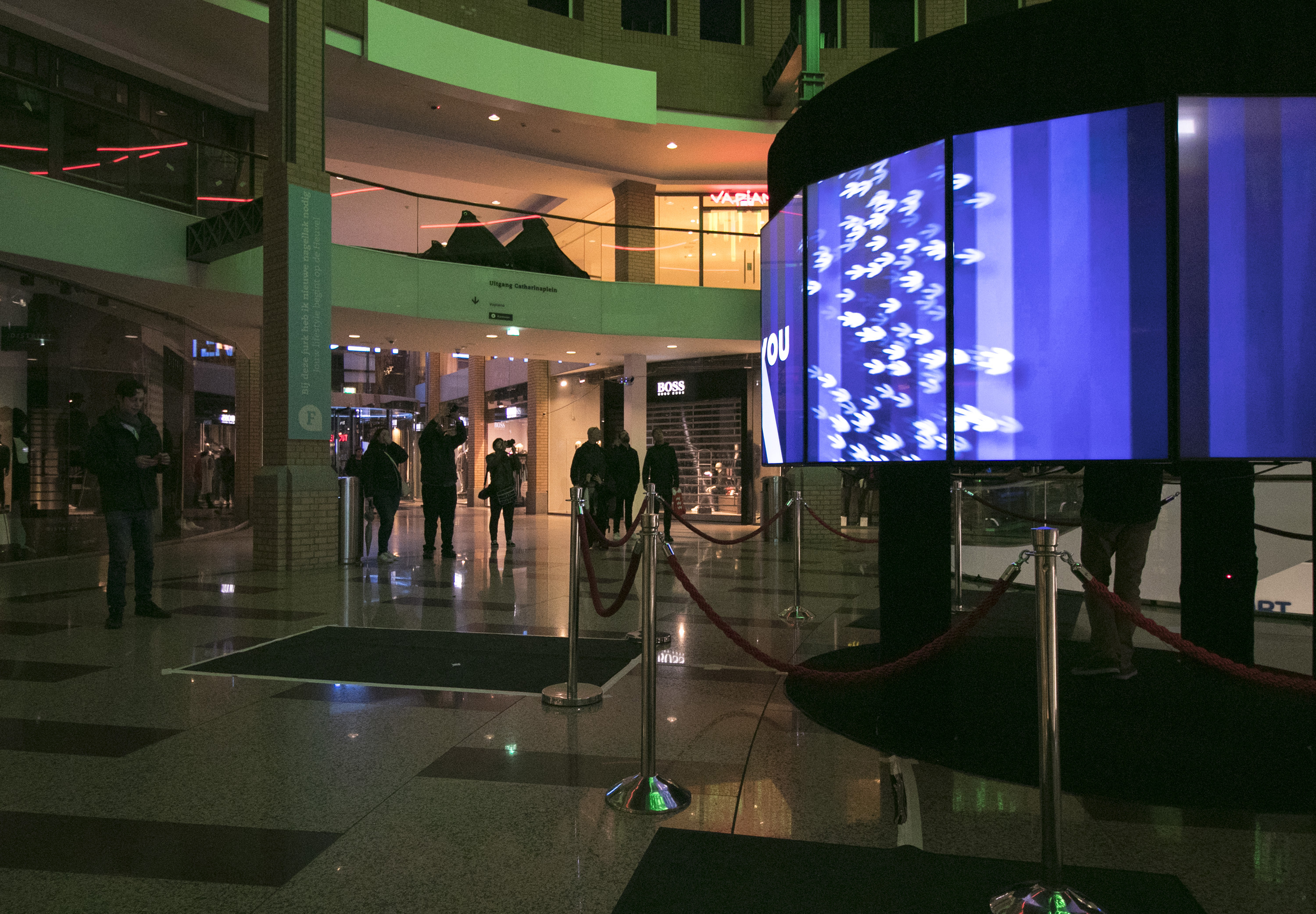
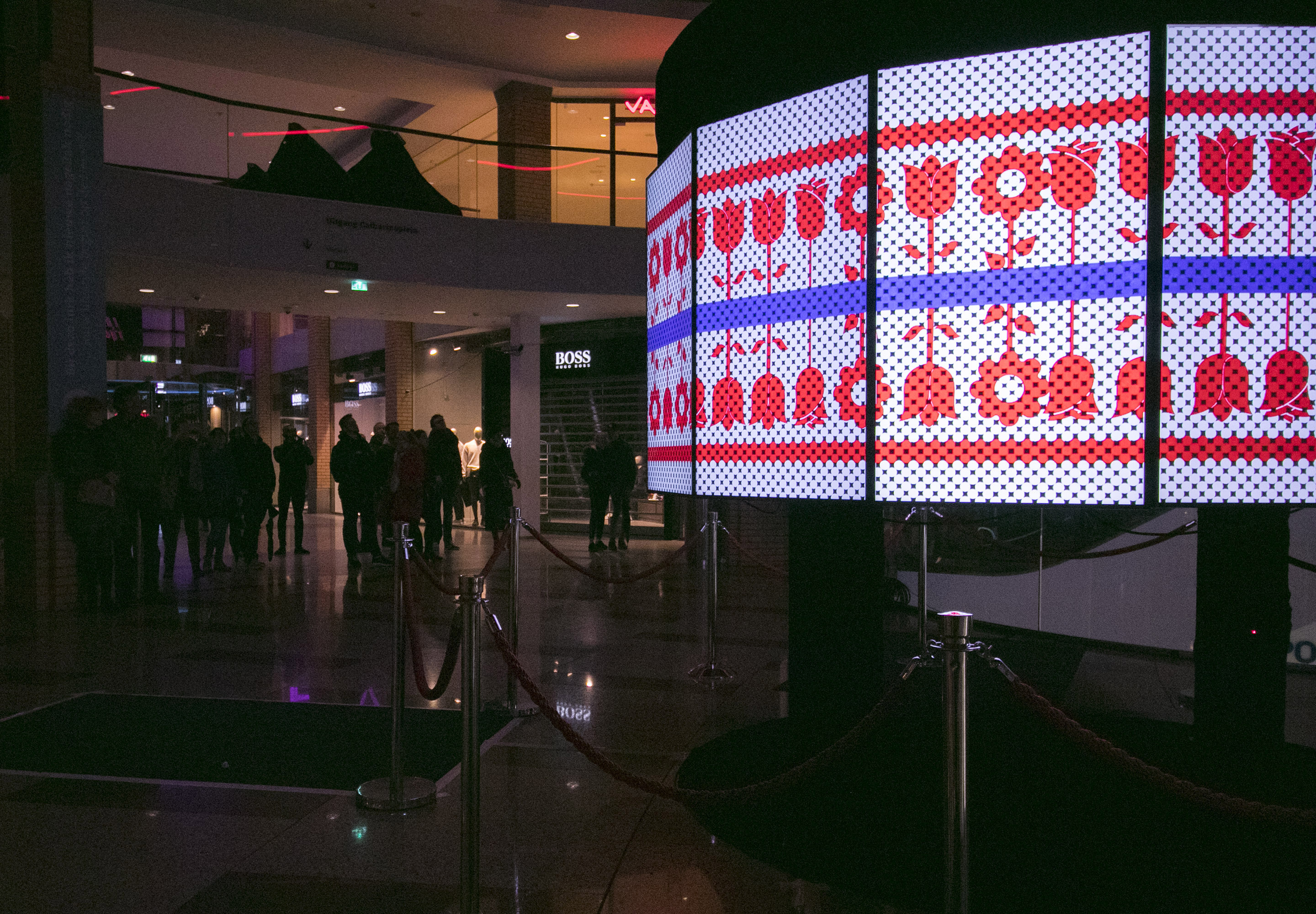
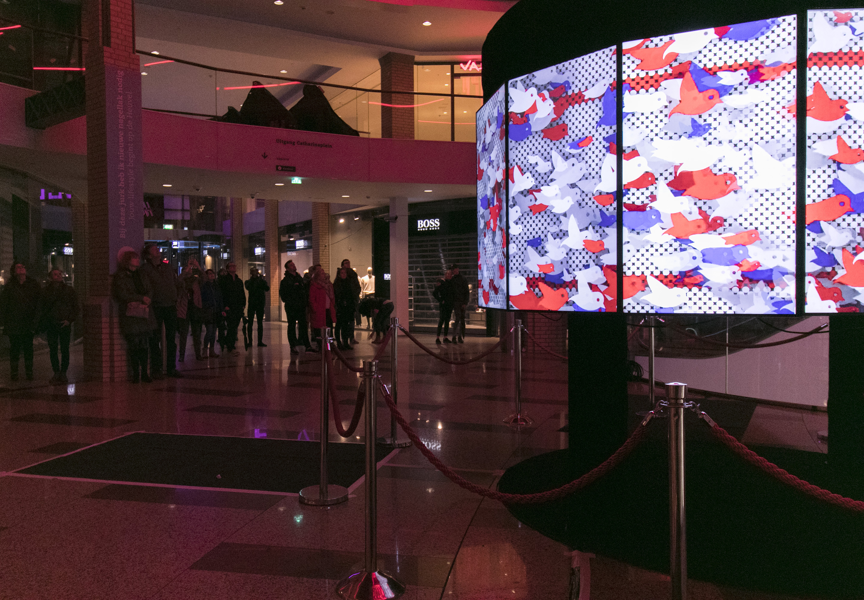
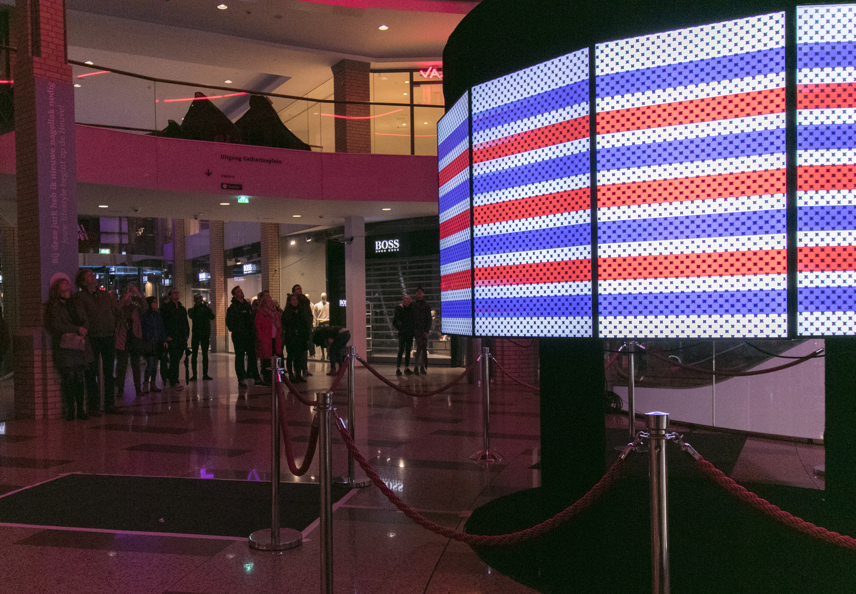
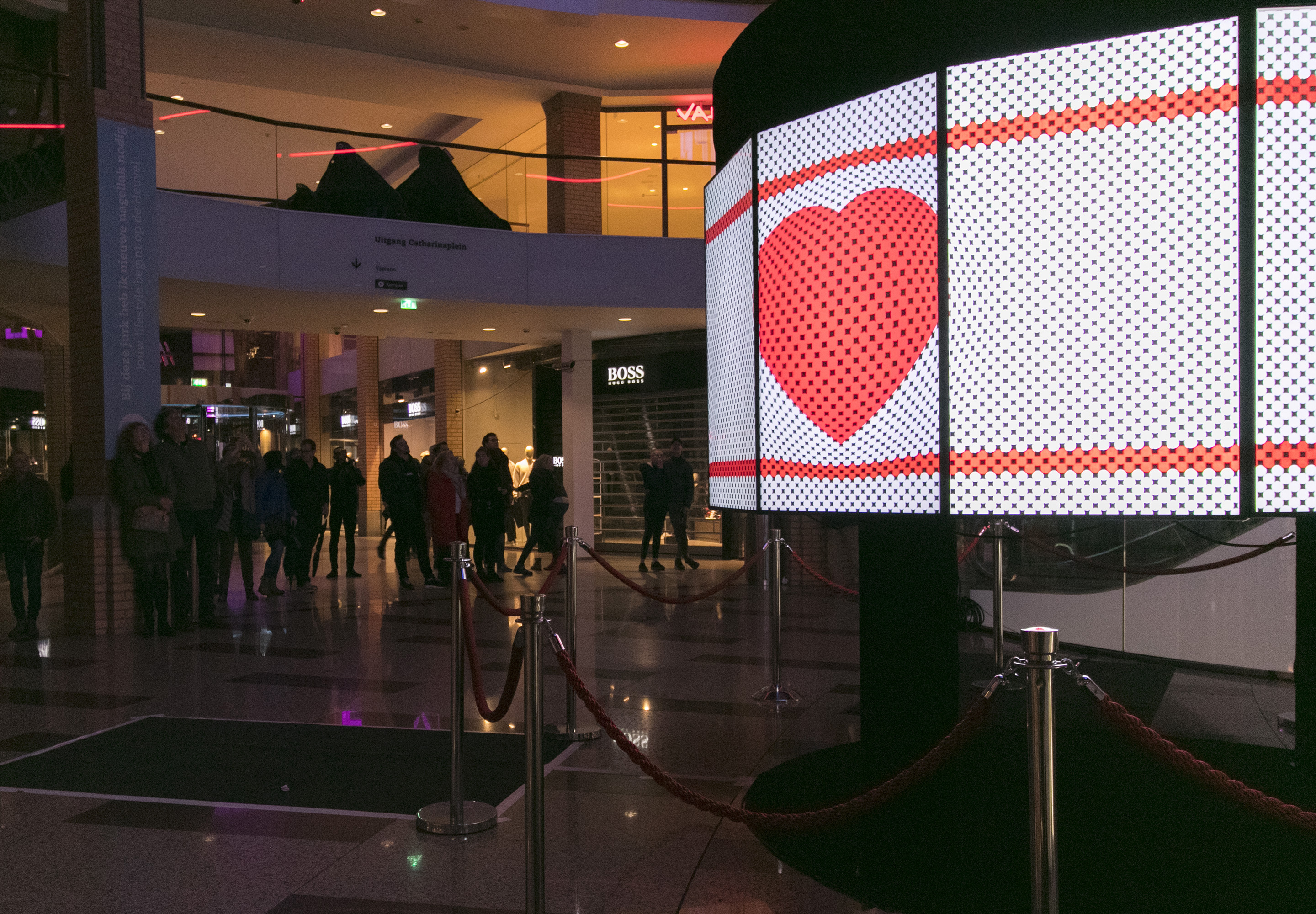
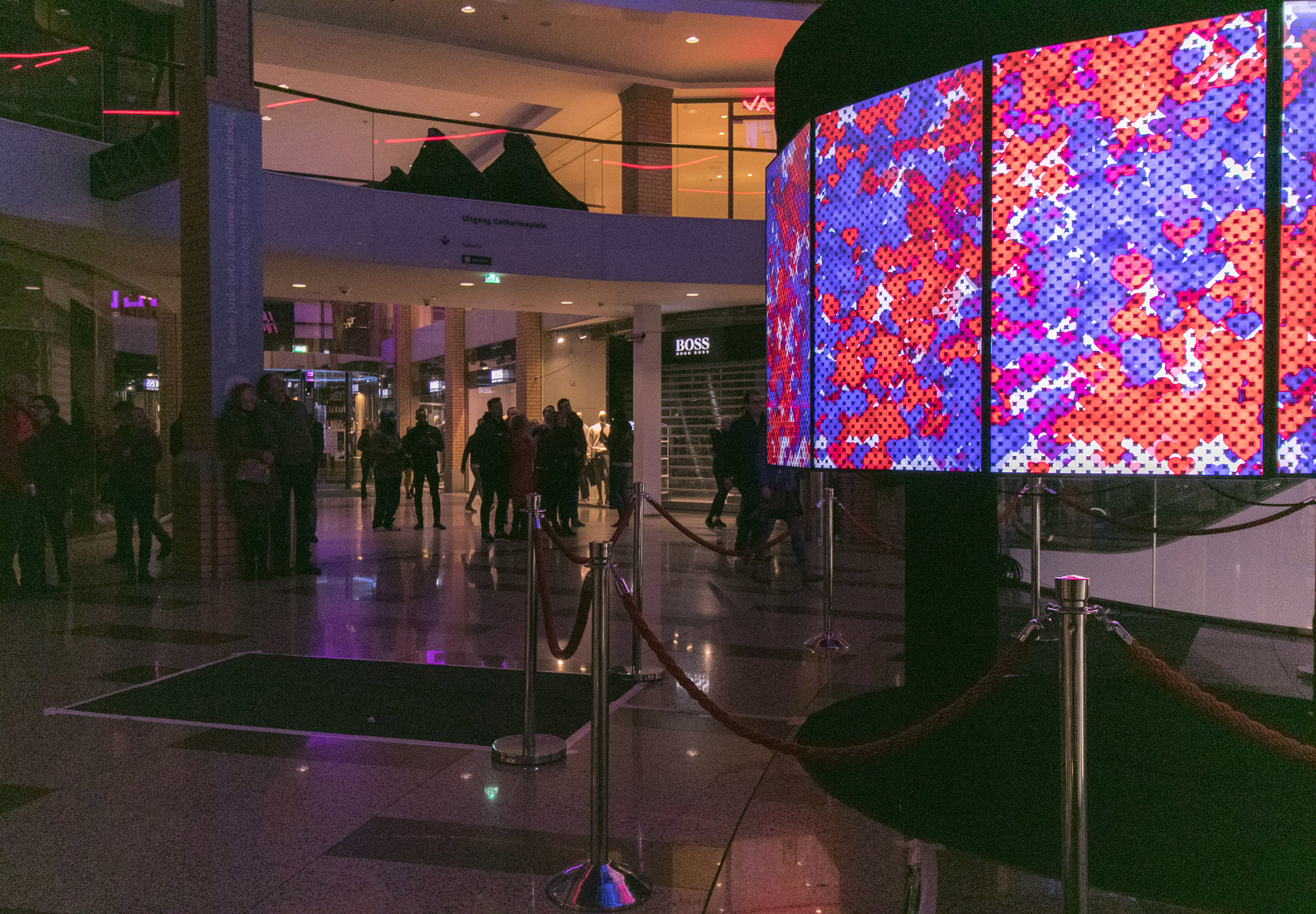
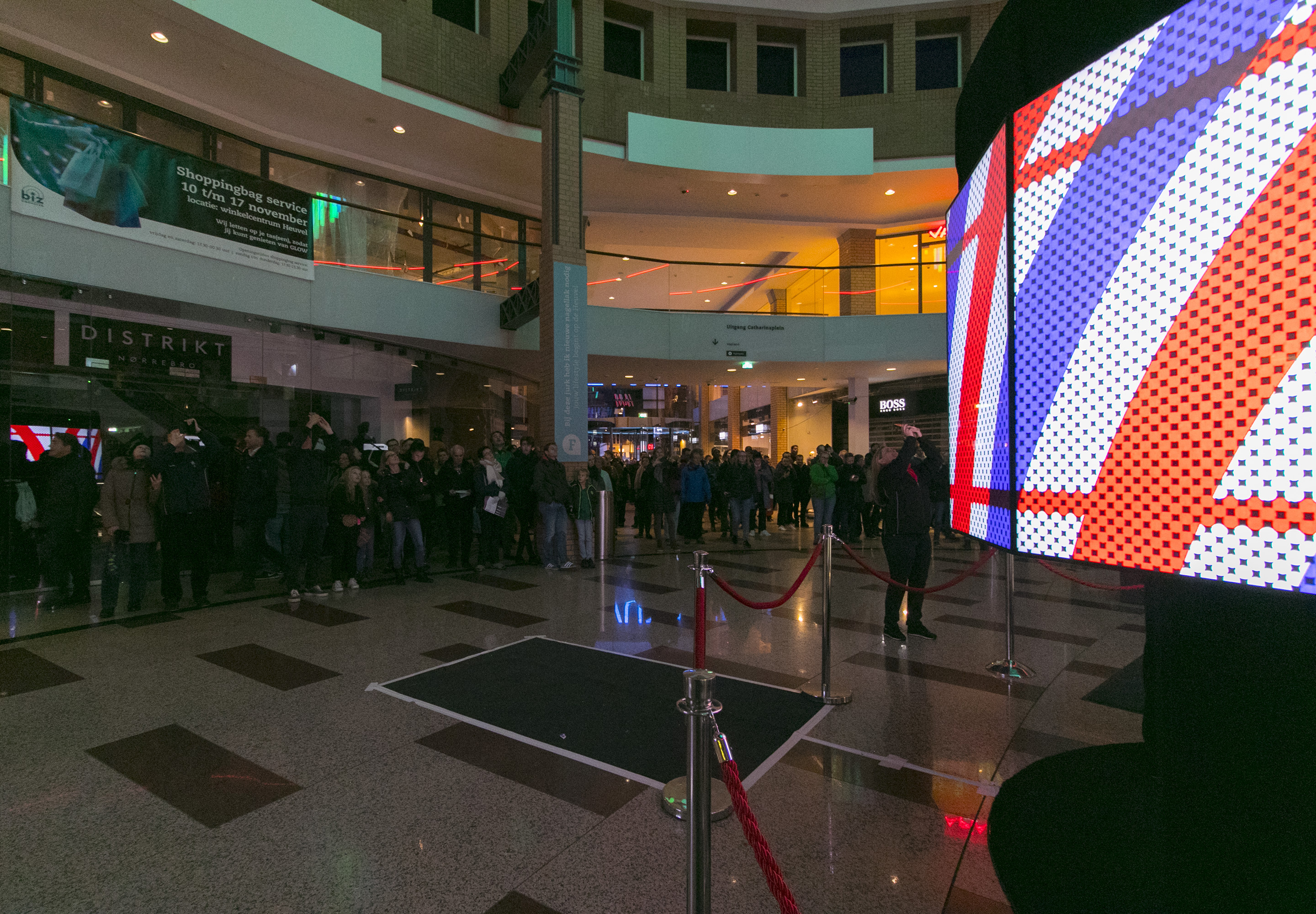
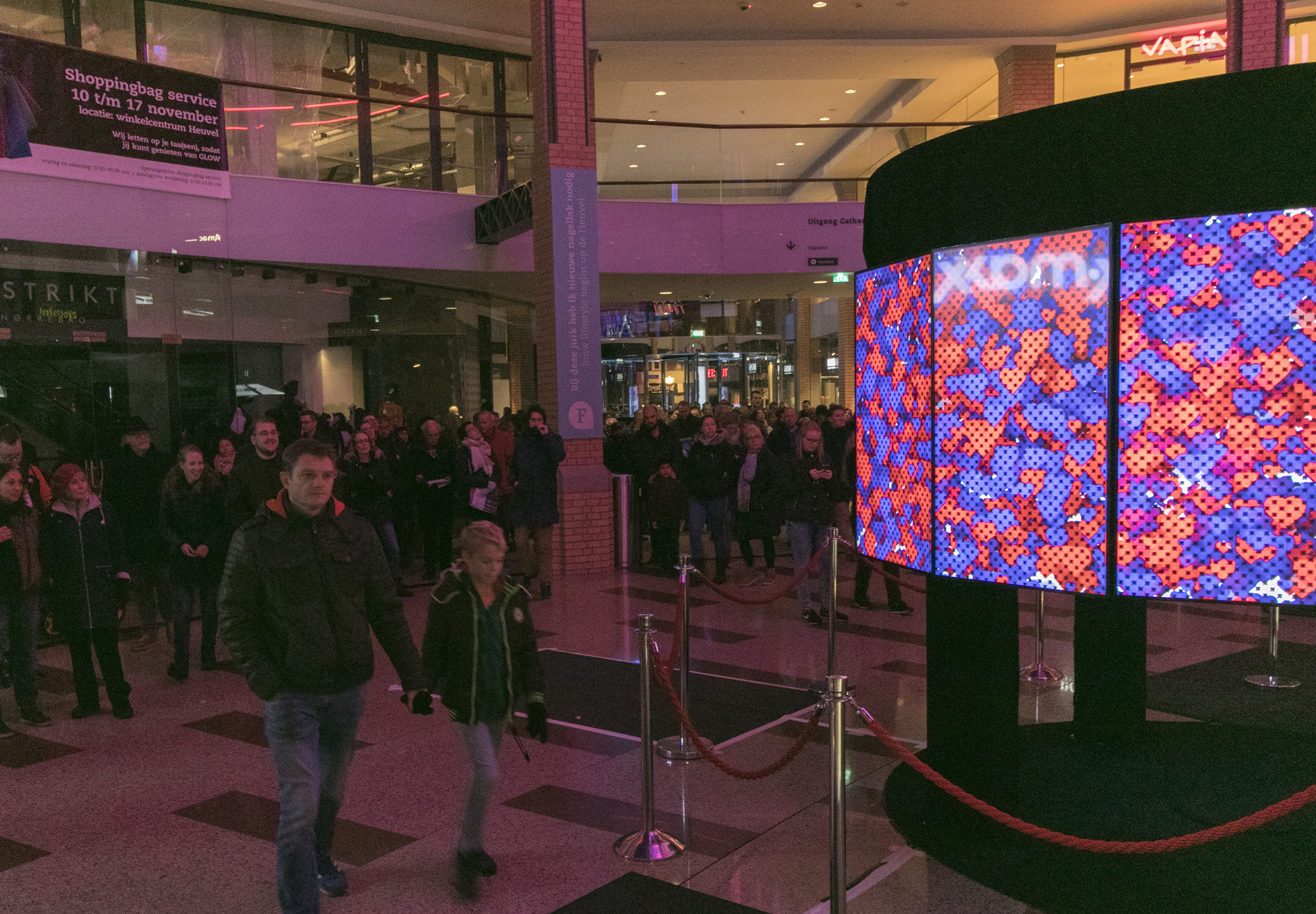
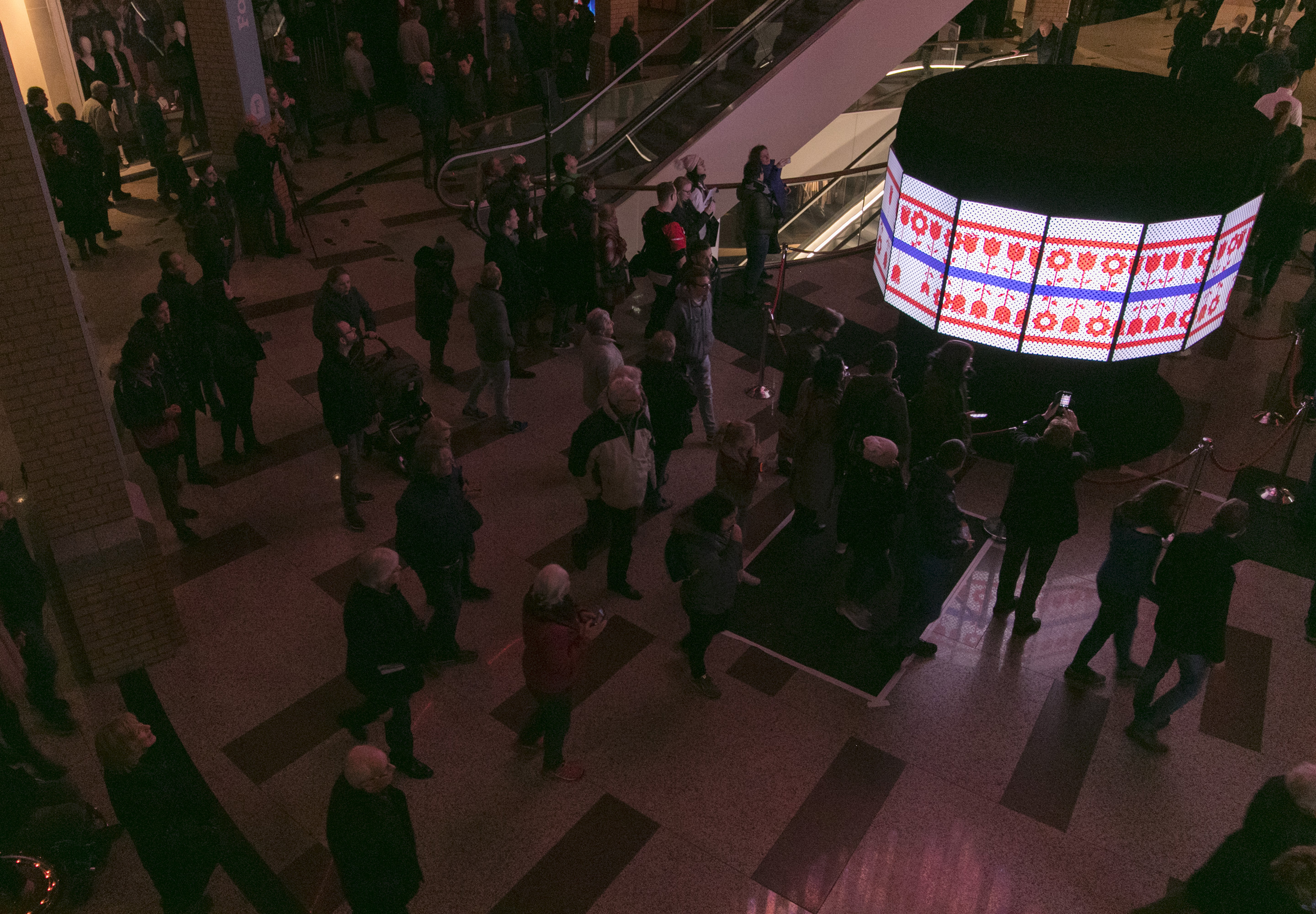
The original visuals were shown at the Dutch Design Week. These were the final designs based on my research, which was shown on the installation consisting of 9 Tv screens without having the chatbot connected yet. The motion-designs were pushed to the screens. This was the result:
At the showroom of the Dutch Design Week, all the separate pieces of work were combined, and the result became visible to the team and to the audience. The DDW exposition lasted for a week, during which this week every member of the team was hard at work trying to get things working properly. At the exposition all visitors heard the sentence that Glowie (still called ‘Sara’ during the DDW) was born on the DDW and was becoming a mature robot. At first, in the first 6 days, the chatbot didn’t work properly. However, during the last day, people were able to talk to Sara, at which time I was able to evaluate the user experience. We noticed that the TV-screens are an eye-catching object, but the booth in which people talk to Sara wasn’t shining at all. I wanted to implement the LED-circle, but that object was missing, so we decided to add Hue-lights, which gave the booth a friendlier look. When the Dutch Design Week was over, the first iteration of development of Glowie was finished.
At the DDW event we exposed the installation and I gathered feedback from the visitors. This was the closing moment of iteration 1.
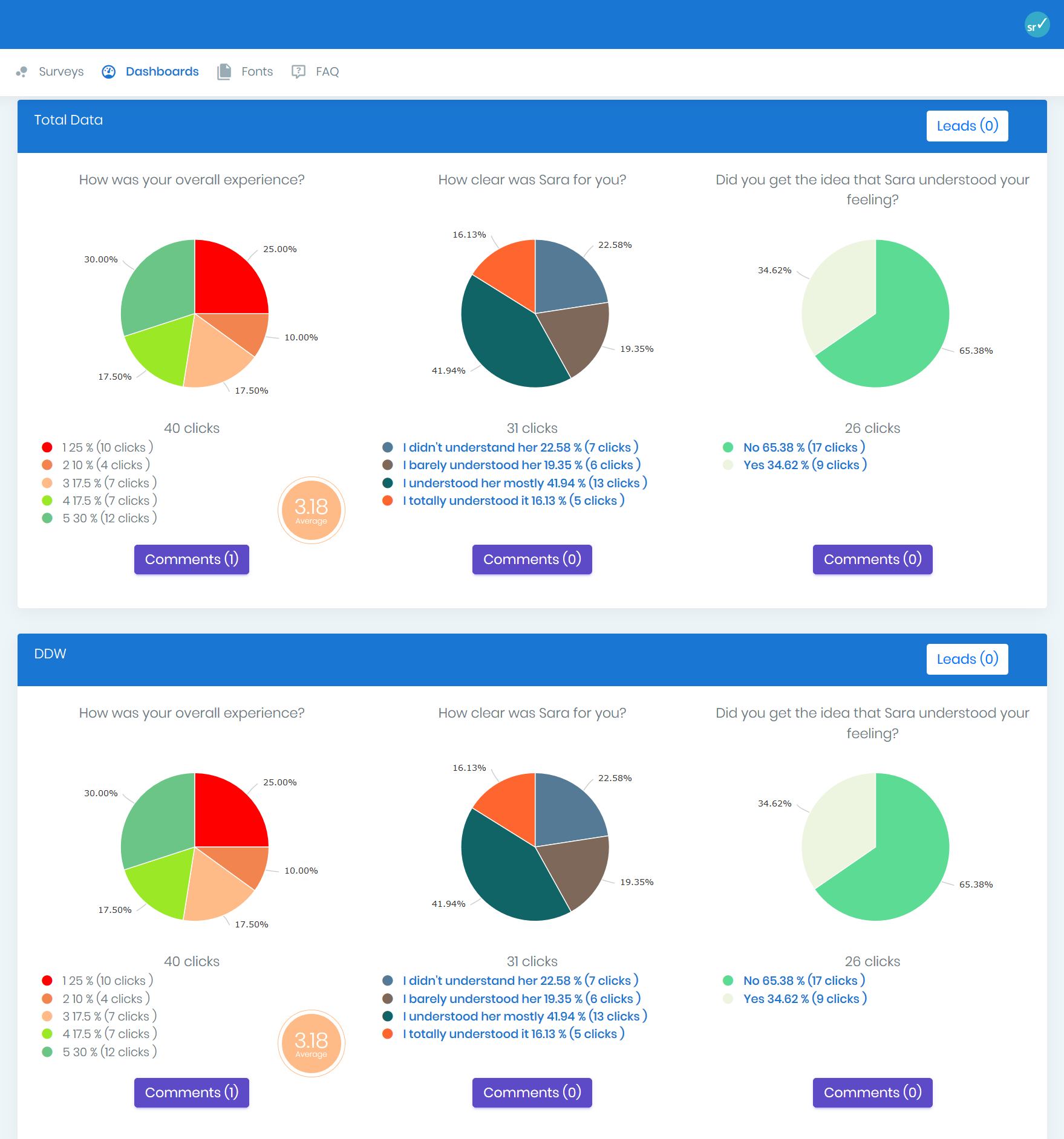
During the DDW event, I set up a questionnaire with 3 questions on an interfaced system on the iPad. On some days, when the chatbot worked a bit, the iPad was next to the installation, which let visitors give feedback about the chatbot.
The questions were;
The results of these questions are shown in this image.
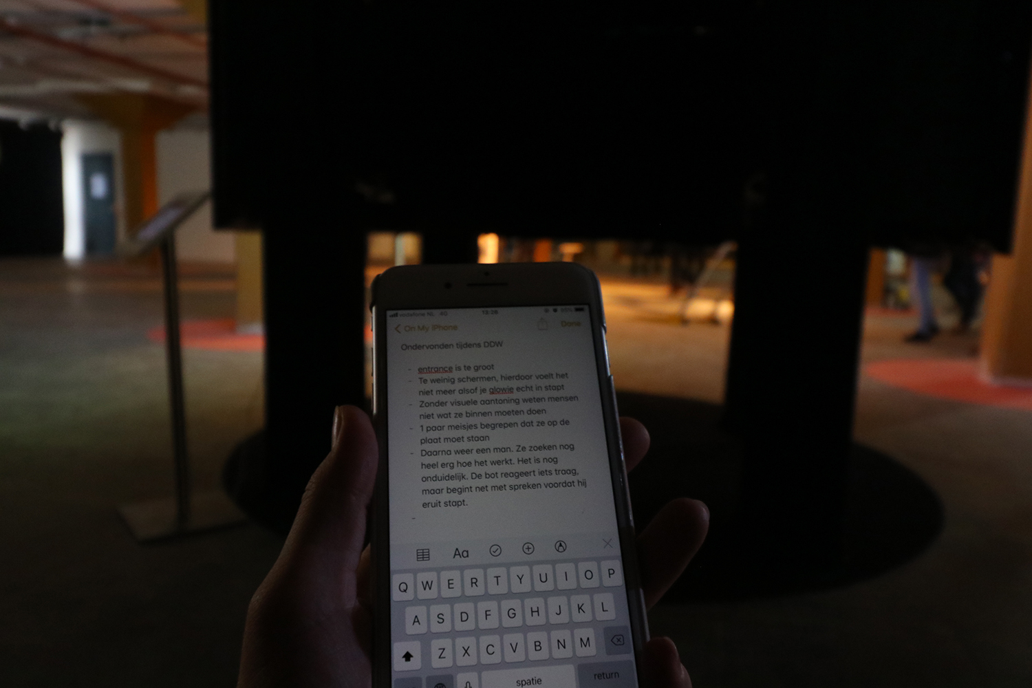
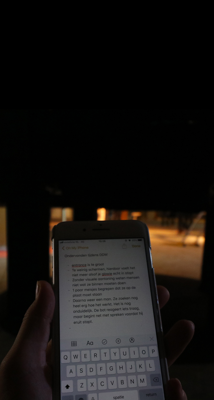
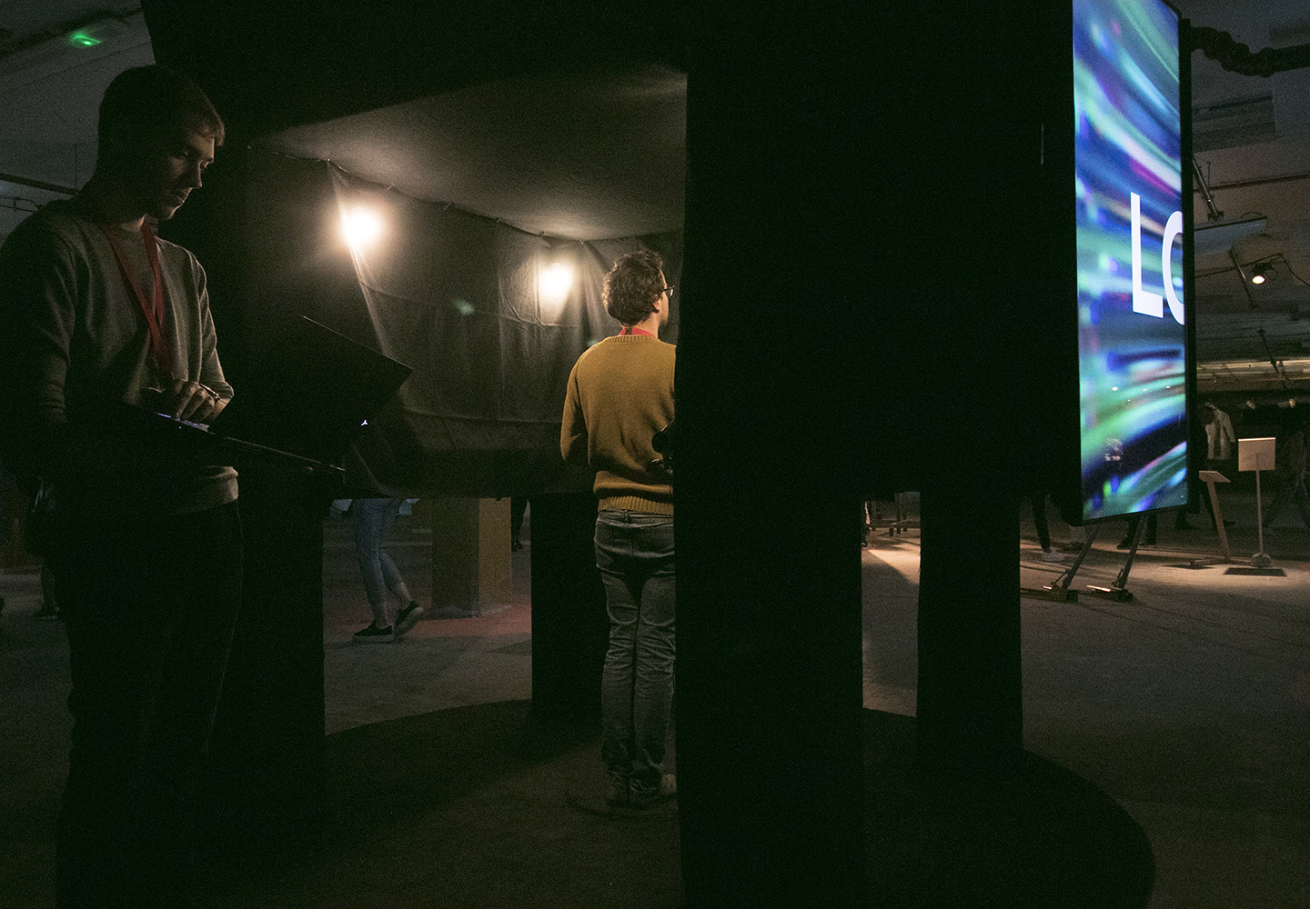
To improve the installation based on feedback from the visitors and users (also known as user testing) I stood most of the time next to the user and noticed their reactions and response. I wrote all feedback into my phone, about every aspect of the installation in the aspect of User Experience. Of this list, I made a top 5 per discipline, so every discipline could improve the installation within their field of work
To provide Greenhouse Group photos and videos of Glowie (Glowie was called Sara at the DDW), I made several photos and videos. The purpose of this video is showing the result of the motion-designs at the DDW.
Lorem ipsum dolor amet, consectetur magna etiam elit. Etiam sed ultrices.
Lorem ipsum dolor amet, consectetur magna etiam elit. Etiam sed ultrices.
Lorem ipsum dolor amet, consectetur magna etiam elit. Etiam sed ultrices.
Lorem ipsum dolor amet, consectetur magna etiam elit. Etiam sed ultrices.
Lorem ipsum dolor amet, consectetur magna etiam elit. Etiam sed ultrices.
Lorem ipsum dolor amet, consectetur magna etiam elit. Etiam sed ultrices.
Lorem ipsum dolor amet, consectetur magna etiam elit. Etiam sed ultrices.
Lorem ipsum dolor amet, consectetur magna etiam elit. Etiam sed ultrices.
Lorem ipsum dolor amet, consectetur magna etiam elit. Etiam sed ultrices.
Lorem ipsum dolor amet, consectetur magna etiam elit. Etiam sed ultrices.
The goal was to let the visitor understand how they can enter the installation and how it works to interact with the chatbot. Another part is that the installation has to look smooth in its design, so the user of the chatbot and the visitor can look at the entire installation without noticing the equipment.
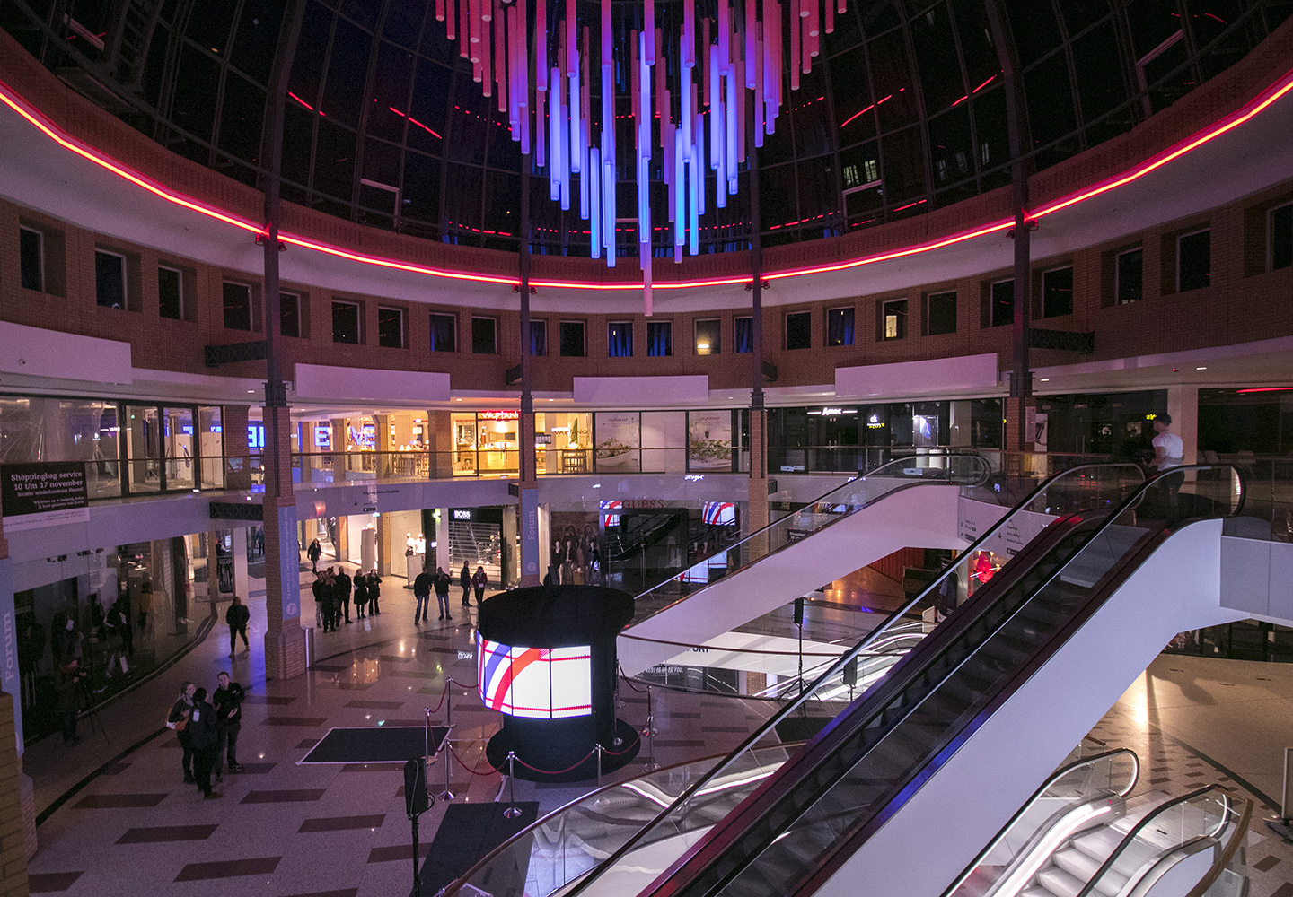
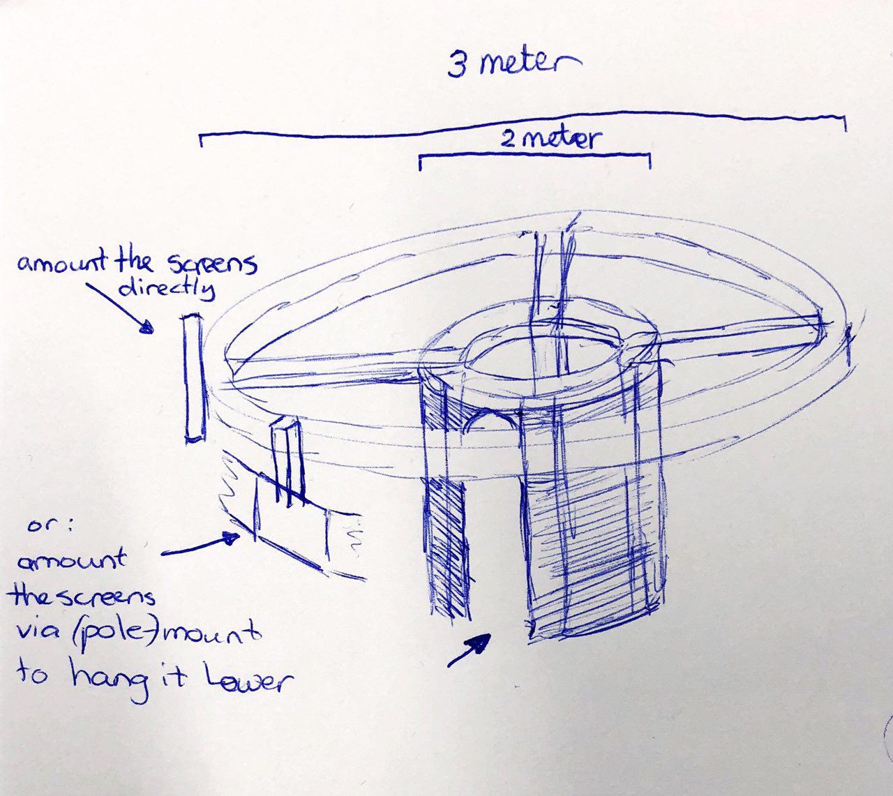
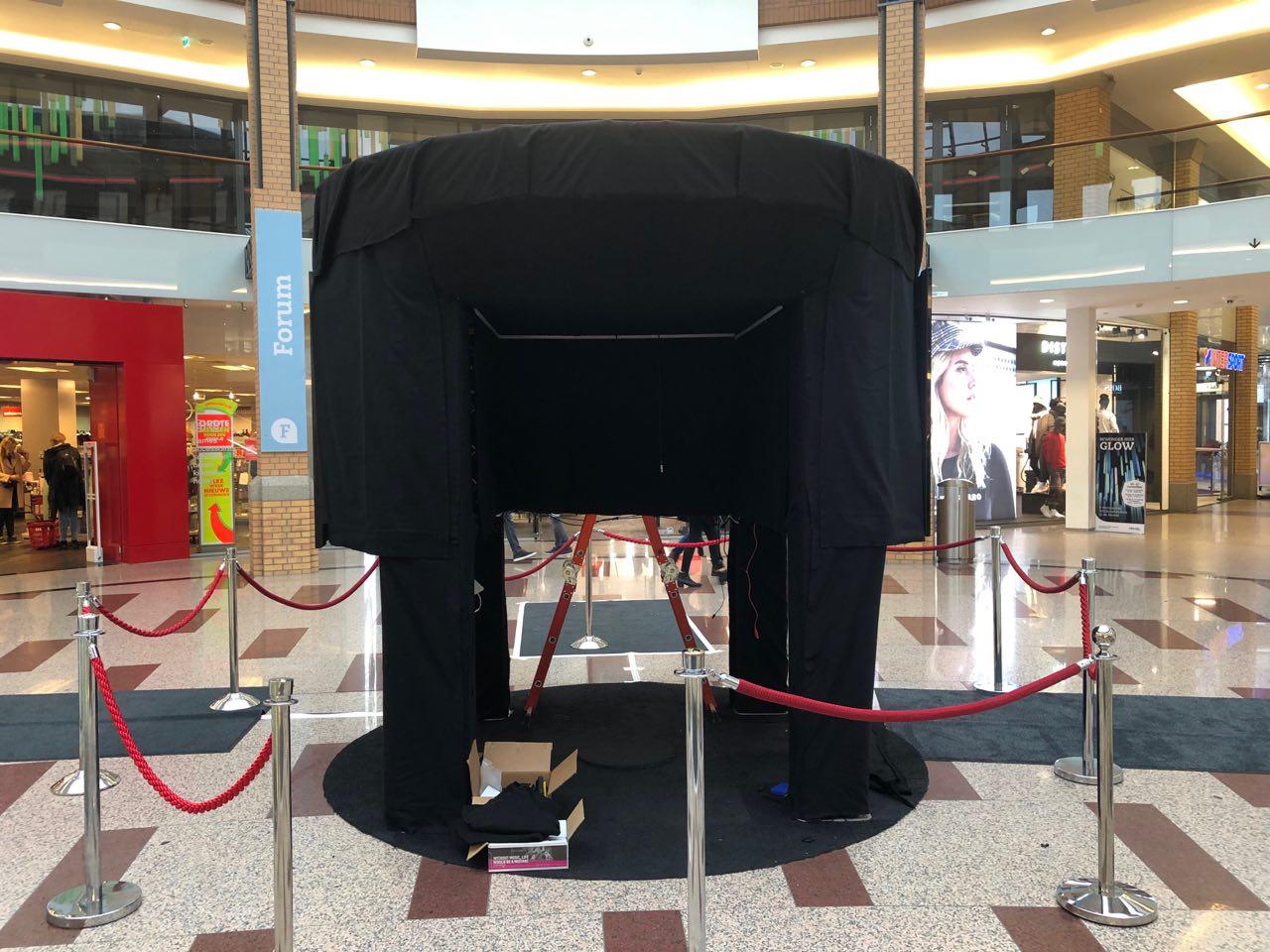
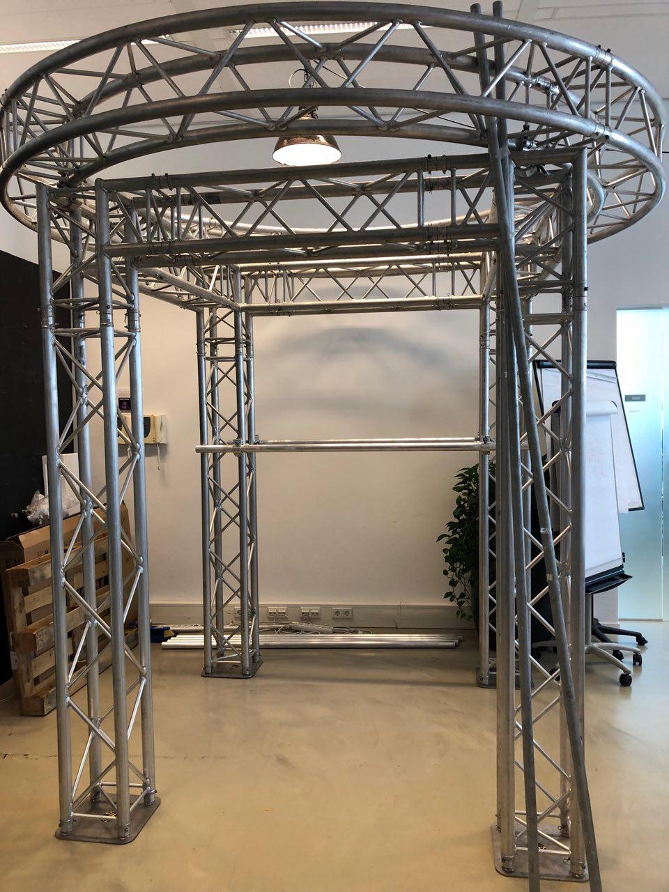
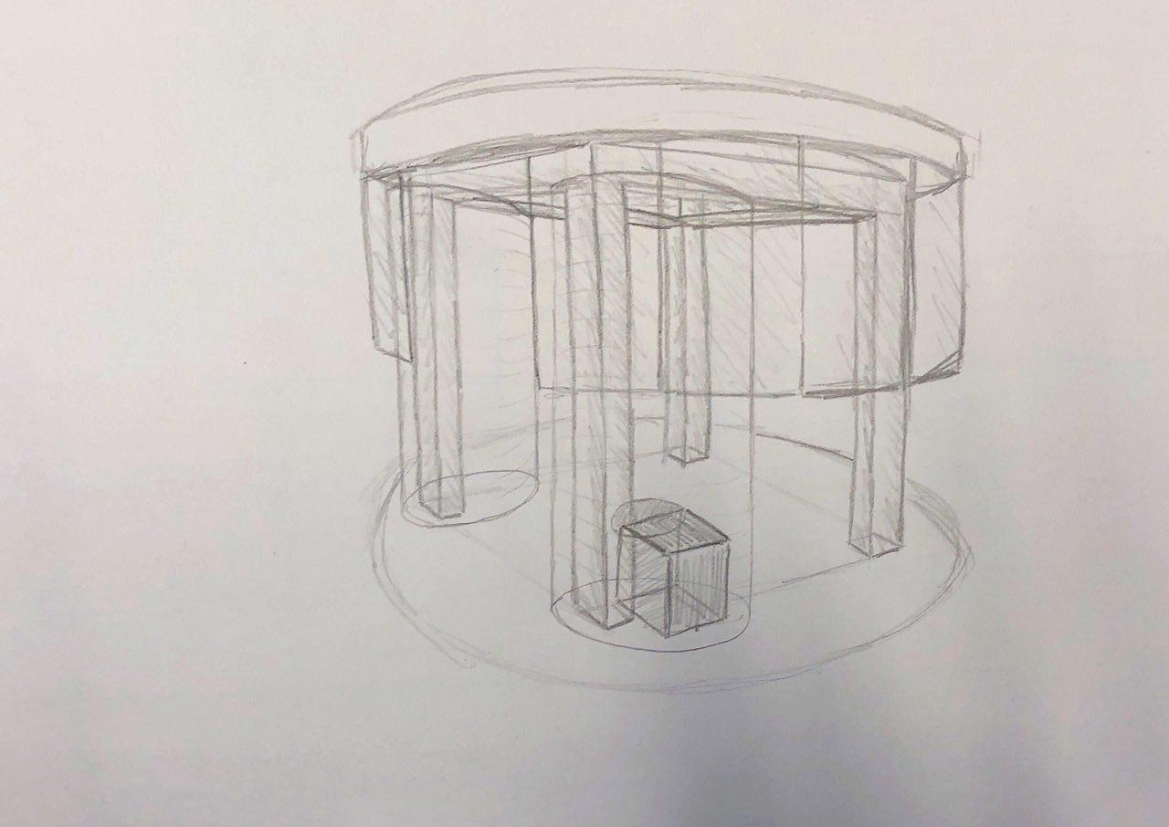
The design of the installation was still explorative, besides it needed LED-tiles (which eventually became TV-screens) and a chatbot. During a brainstorm, I’ve made several sketches of how the installation could look like and what the best place could be to stand during the Glow event. In a team-meeting, all the team-members showed their idea and the whole team voted unanimously for the design the senior designer made. This design wasn’t practical, so for that I needed to make a solution. The best outcome was a floating installation, where people could see a standing person in it. This wasn’t practical in the Heuvel, because it means it needs to be hung down from the roof. The position of the installation was under another project, so that wasn’t do-able. I came up with the idea of a Truss-system, because of my experience in that. There are round-truss circles available, that fit on top of a square shaped truss installation. This means the screens could hang on it and the installation would have an organic shape.
There was a practical solution needed for this design, so I’ve had a second iteration of sketching possibilities of the installation, where I put the design of the senior designer as a base-line. Because of a very late delivery time of the screens and other equipment, I needed a longer time then expected to sketch the installation and measure it to take the next steps of the design around this skeleton.
To get a better understanding of how the user will experience a visit to the installation and chatbot, I wrote multiple user stories in this document.

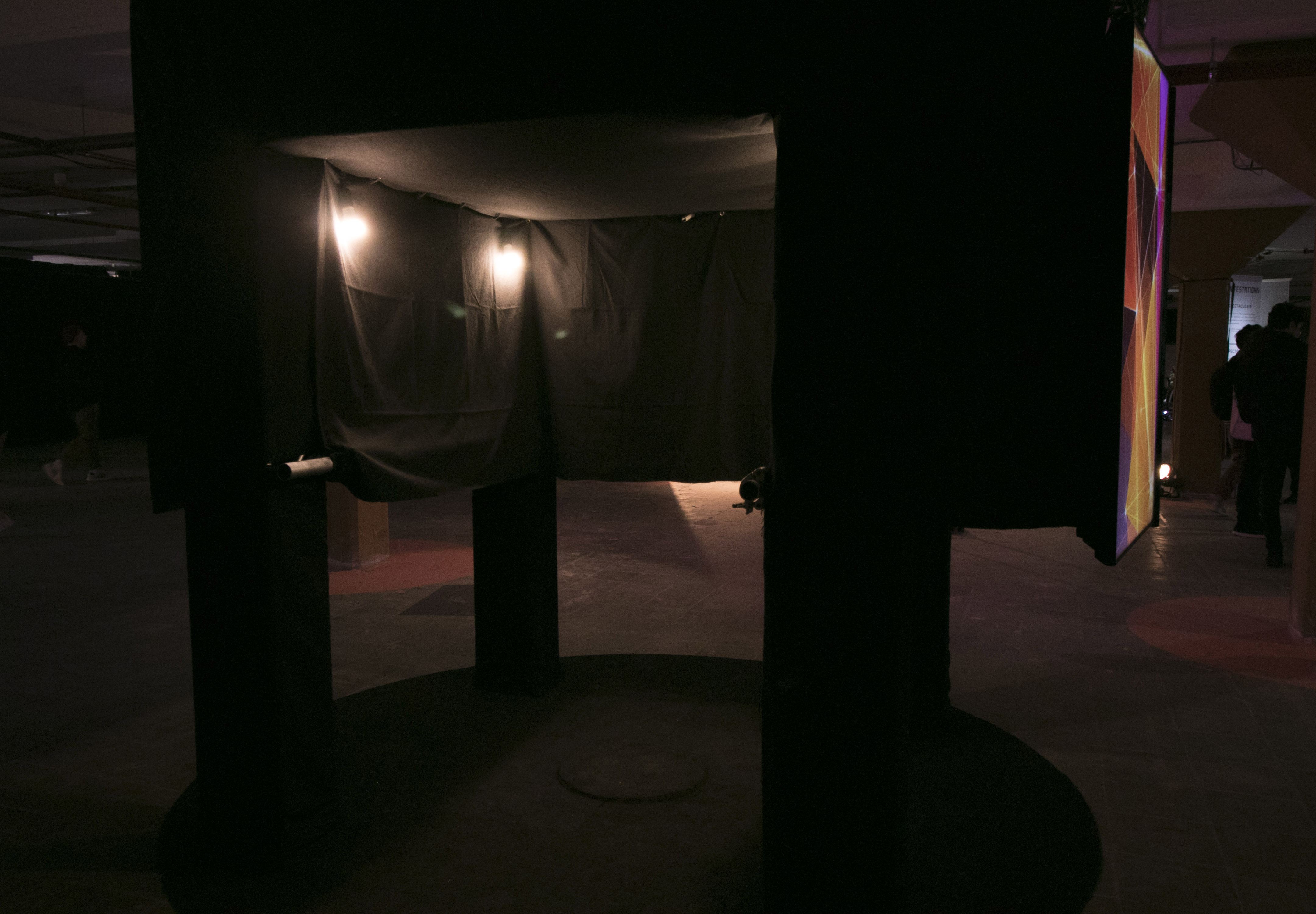
A new question arose: What is the best outcome of a design, what hides the Truss-system in the best possible way? The answer was a floormat, which has a mute-effect on the echo, and with the black color, the theater cloth wouldn’t stand out. To cover the installation and the part on the inside at the height of the TV-screens, the equipment would be covered, and the legs would be visible.
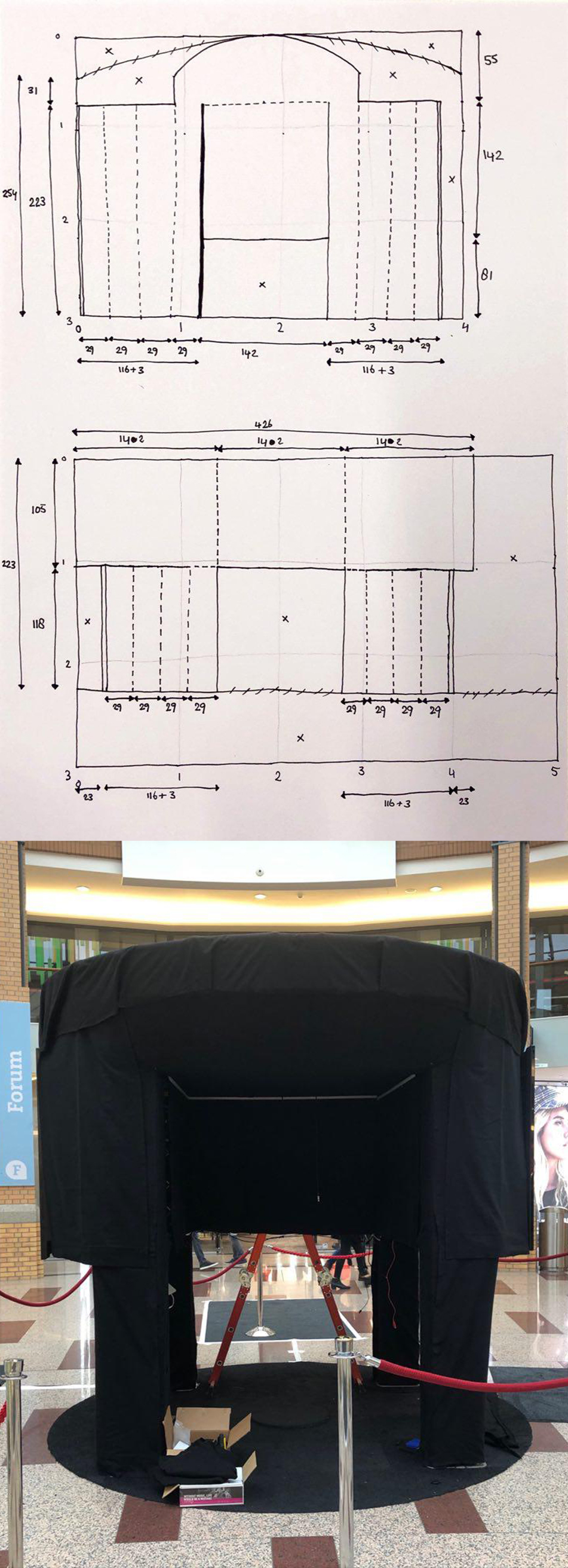
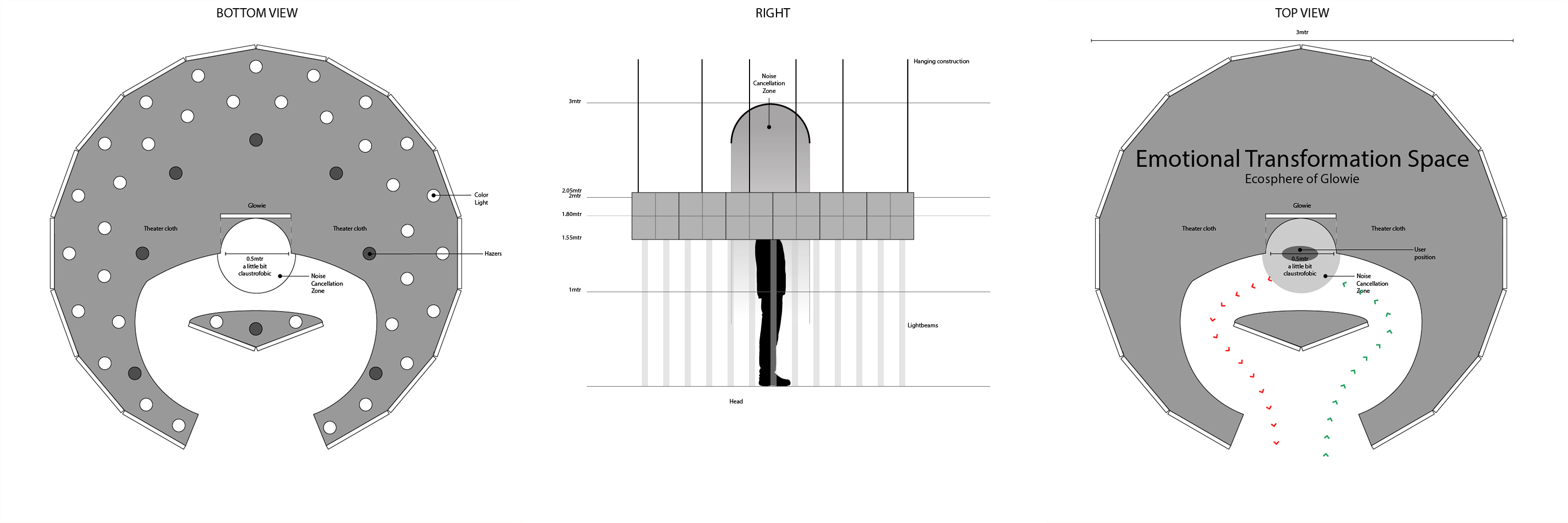
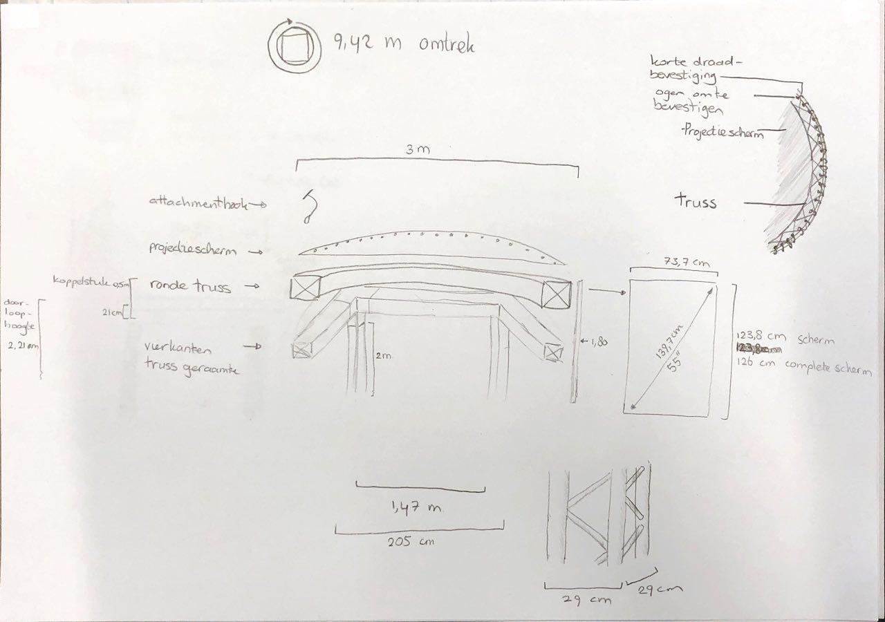
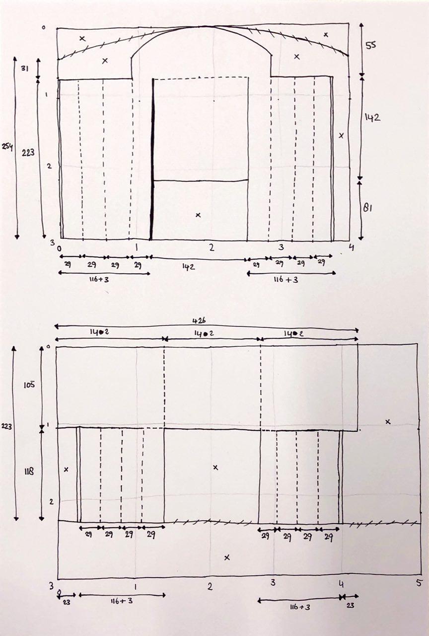
To form this design, I needed to adjust a large floormat and theater-cloth, which needed a lot of time and calculation and this was the process of it. This sketch shows how the first two theater-cloths needed to be cut. This is the theater cloth, fitted into the installation. The theater-cloth is attached to the Truss-installation with attachment-hooks and Velcro. I choose theater cloth because of its fire-retardant properties, which is primarily on a huge event like Glow. There would be lots of visitors inside the Truss, which made this even more essential.
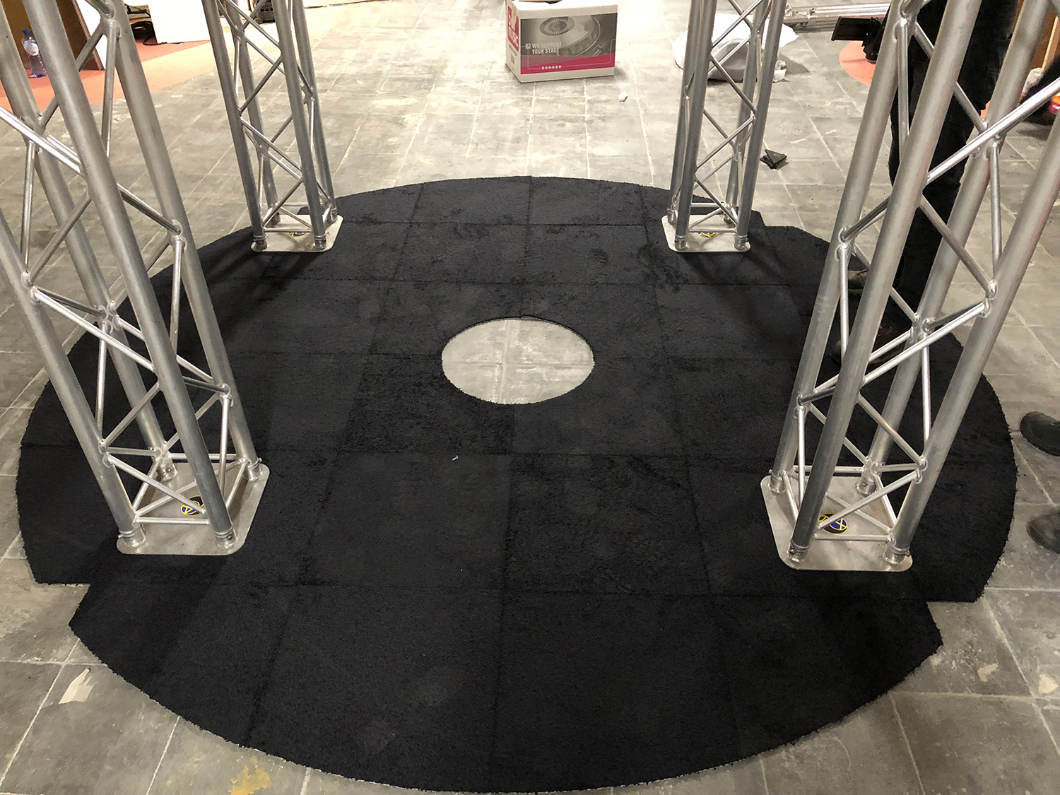
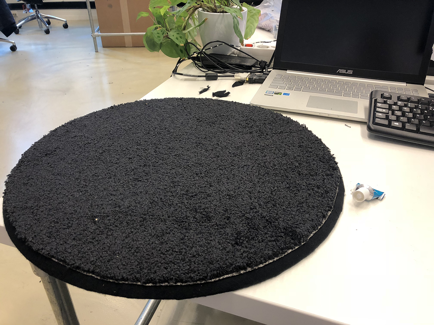
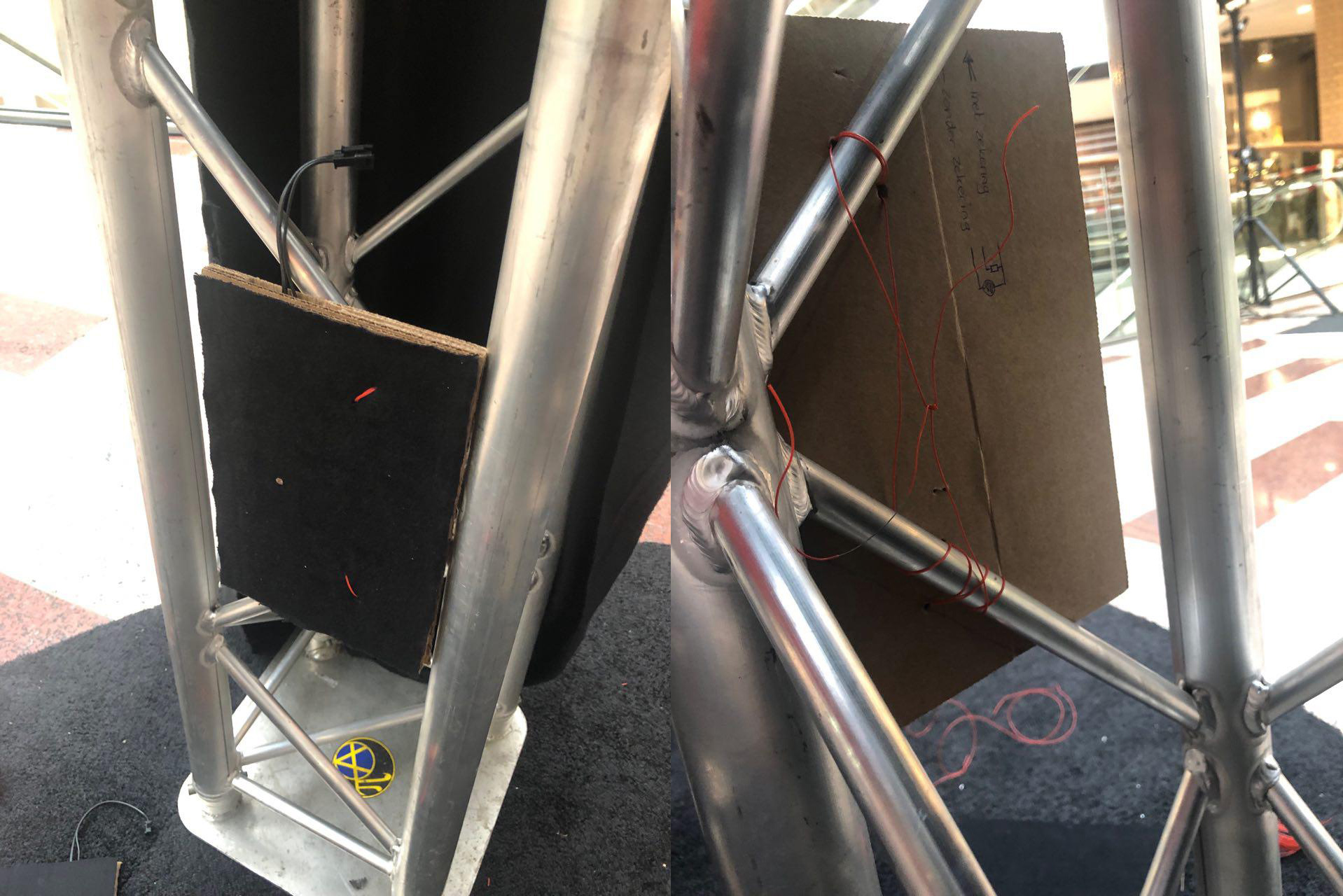
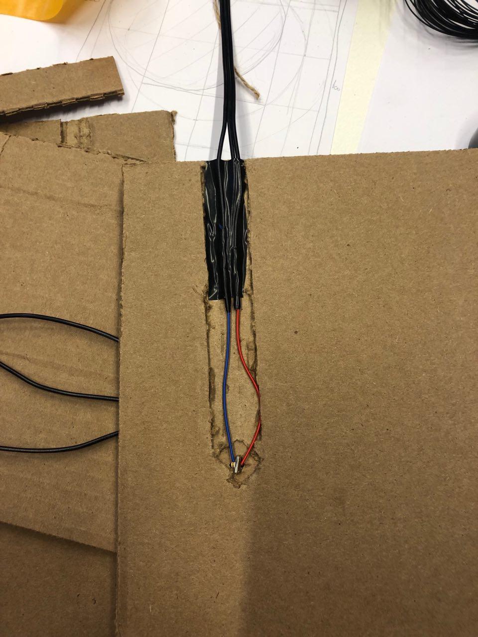
There needed to be 36 floormats to cover the bottom-part of the installation. I have cut the mats into the proper shape. The floormats were aligned with the edge of the circle-shaped Truss. Because a detection system will be used on the ground, I made a circle-shaped pressure-plate in a design which fits with the rest of the floormat. The diameter of this pressure-plate is 50 centimeter and is skewed at the edge of an angle of 45 degrees. Laser-technique was needed to detach a new-user. This needed to be soldered and designed, fitting with the theater-cloth. I used the cardboard-technique. This shows the process.
To give the installation a design which fits with the technology and skeleton, there was a floormat, laser-sensor, theater-cloth and truss-system needed. I measured all of it, so it will fit together where the user experience was the main target. Cut the 36 floormats to a precise round shape together. After measurement, cutting, the theater-cloth fitted perfectly onto the installation. The equipment was made invisible.
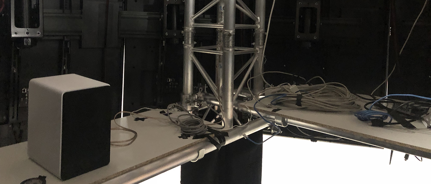
Wooden planks are built onto the installation, which provides standing place for the equipment, like the sound boxes and computer. The choice of wooden planks is made after sketches which showed that the equipment needed a lot of space on the ground of the installation. This gives away free sight of the legs of the user. Because of the shape of the round Truss, where the TV-screens were hanging on, there was precise measurement needed. This is made visual in this image. With this measurement the wooden planks could be ordered.
This all together formed a whole with the decisions the team made. During a team meeting, all decisions were made, what happened just a few weeks before the Dutch Design Week. Before that meeting, the team kept hanging in the brainstorm-phase. After the Dutch Design Week, we evaluated the feedback we received during this week and make improvements based on that to the whole, during the second iteration, which included 2 weeks.
During an event with a team of 7 people, a script was needed for a good team-flow. To form this script, the availability of the team-members needed to be organized in a planning, in which every team-member could fill in their availability. I made this scedule to get an overview of the availability of the team. Based on this outcome, I created the script covering the duration of the Glow-event. There needed to be at least 3 people present at the installation at any time. One person was needed to accompany the visitors in line and another person standing in the booth to guide the user of the chatbot. The third person must be a technical member of the team, who could fix direct hardware or software issues. If an extra person was available, he or she could guide and inform the visitors in the crowd. All elements of the design for the installation fit together and muted the echo in the Heuvel. On this hyperlapse the whole installation is shown.
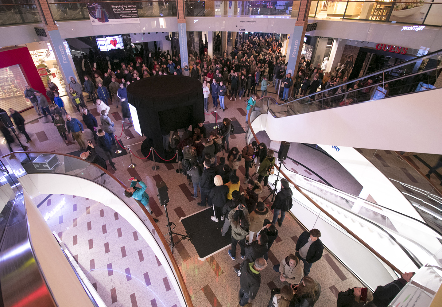
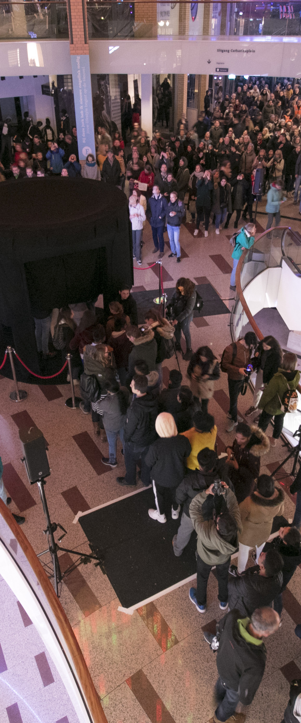
At the end of iteration 2, we had the exposition at Glow and ended the process of this project. The installation was standing at the Heuvel nearby the Catharina Church. I was guiding the crowd and visitors towards Glowie and I saw and heard what people experienced all the time. That gave me a good overview of the target we set for the team; We want to give the visitors a great experience, where they come out the installation even happier. We were also in the top 7 highlights to see during the Glow festival, written by Omroep Brabant.
During the Glow event in November 2018 I made this concept-movie. The target-group of this movie was the Chinese delegation. For documentation and marketing purposes I photographed the installation.
“What is the best outcome of sound- and motion-design so that the average of the visitors of Glow will like the project?” This was the original sub question. It has been changed because of the influences of Stakeholder X, where the senior-designer took over this task.
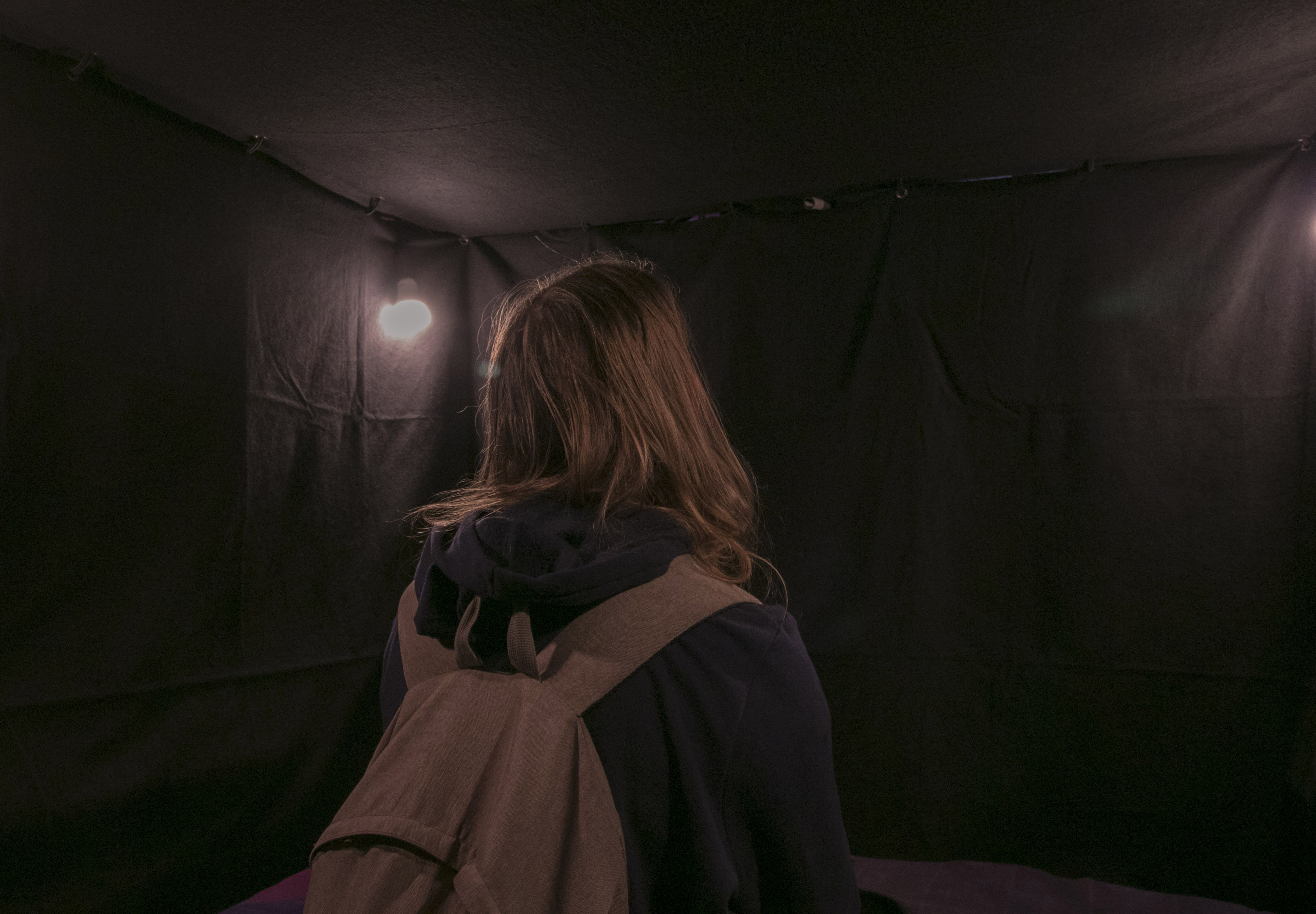
The goal was to make the user of the chatbot understand what’s happening during a chat, by making a design based on a good User Experience.
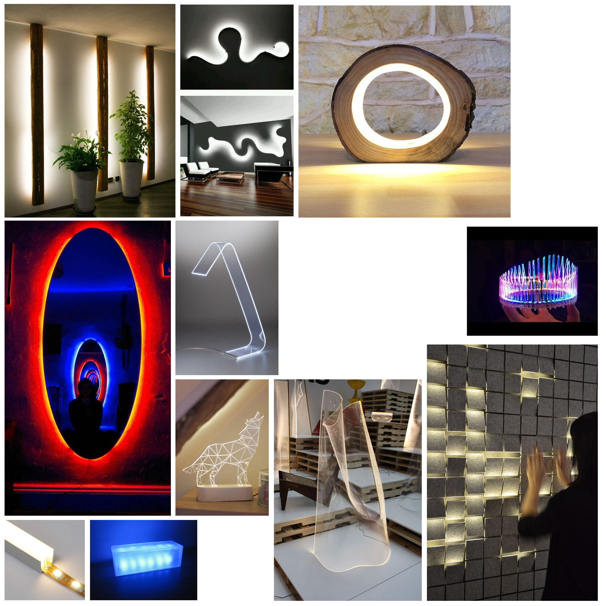
To form ideas for the visual identity of Glowie the chatbot, I did do a brainstorm by research on Pinterest and making sketches;
The team decided to give an abstract identity to Glowie, after testing on the DDW without a visual appearance. We used the LED-circle to express the identity. Based on this, I’ve done a brainstorm and made a moodboard to get inspired and form ideas for the design around this technology. A few results of this brainstorm were;
To make clear to the whole team, I formed a Requirements list (in dutch), based on a good User experience, about the must-haves and the won’t-haves of the identity of Glowie, as a guide-line to the team
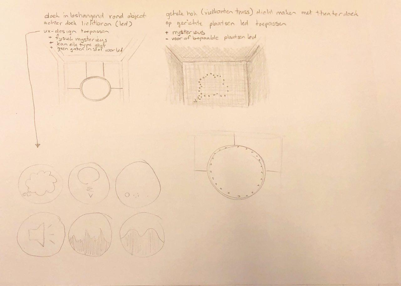
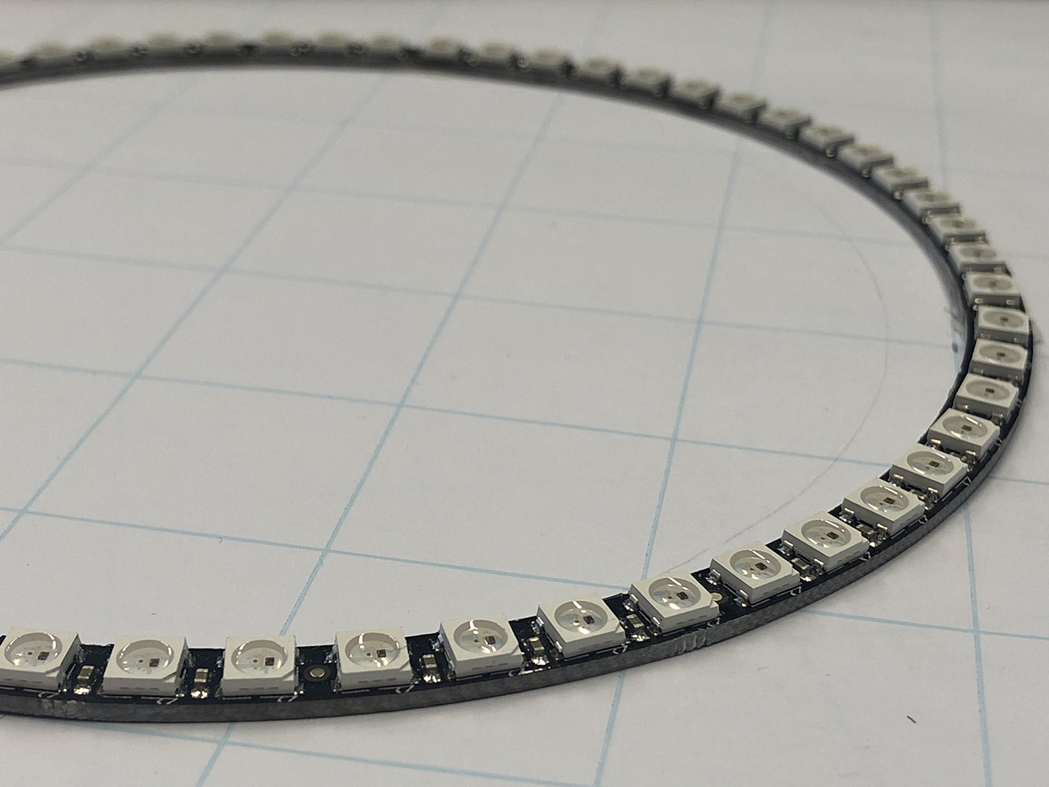
To improve the User experience during the chat with Glowie, there needed to be a UX-based design for the behaviour of the lights of this LED-circle. To accomplish that, sketches of this design were needed. I sketched which lights should go on and off in a pattern or could fade in intensity of light.
Because the LED circle suddenly disappeared, this wasn’t carried out.
The whole team brainstormed again for a good visual appearance of Glowie, with a good User experience in mind. When the team started to discuss about LED-strips, I started to design a pattern for this LED-strip, in the form of a user story and a mock-up.
Some ideas were brought up in a team-meeting, where I made a presentation for. Another idea, which came from the technical team, was to express Glowie in a light-bulb and give the booth an abandoned look and feel by flashing of the LED-strips. The User experience-based design of my design became involved in this concept.
At Glow I the helping hand most of the time. There I could see if the UX works on the user of the chatbot. In comparison with the target group of the Dutch Design Week, the target group of Glow understand better that they must wait for response of Glowie.
The Glowie installation, where a lot of technical and design elements are combined to form this whole, was exposed at Glow 2018. The chatbot gets input from the user by getting input via a microphone and gives output by two sound-boxes, aimed to the user. When the code of the chatbot recognizes specific words what the user said, the system follows the pre-set dialog-flow with text, made by the copy-writers. When the system gets input from the user about the emotion he has, the flow in the dialog changes and gives a specified flow. Meanwhile, on the screens is shown a pre-set motion-design which visualizes the emotion the user said. Under these motion-designs is sound-design preset which is hearable from a sound-system with 4 powerful sound-boxes around the installation.
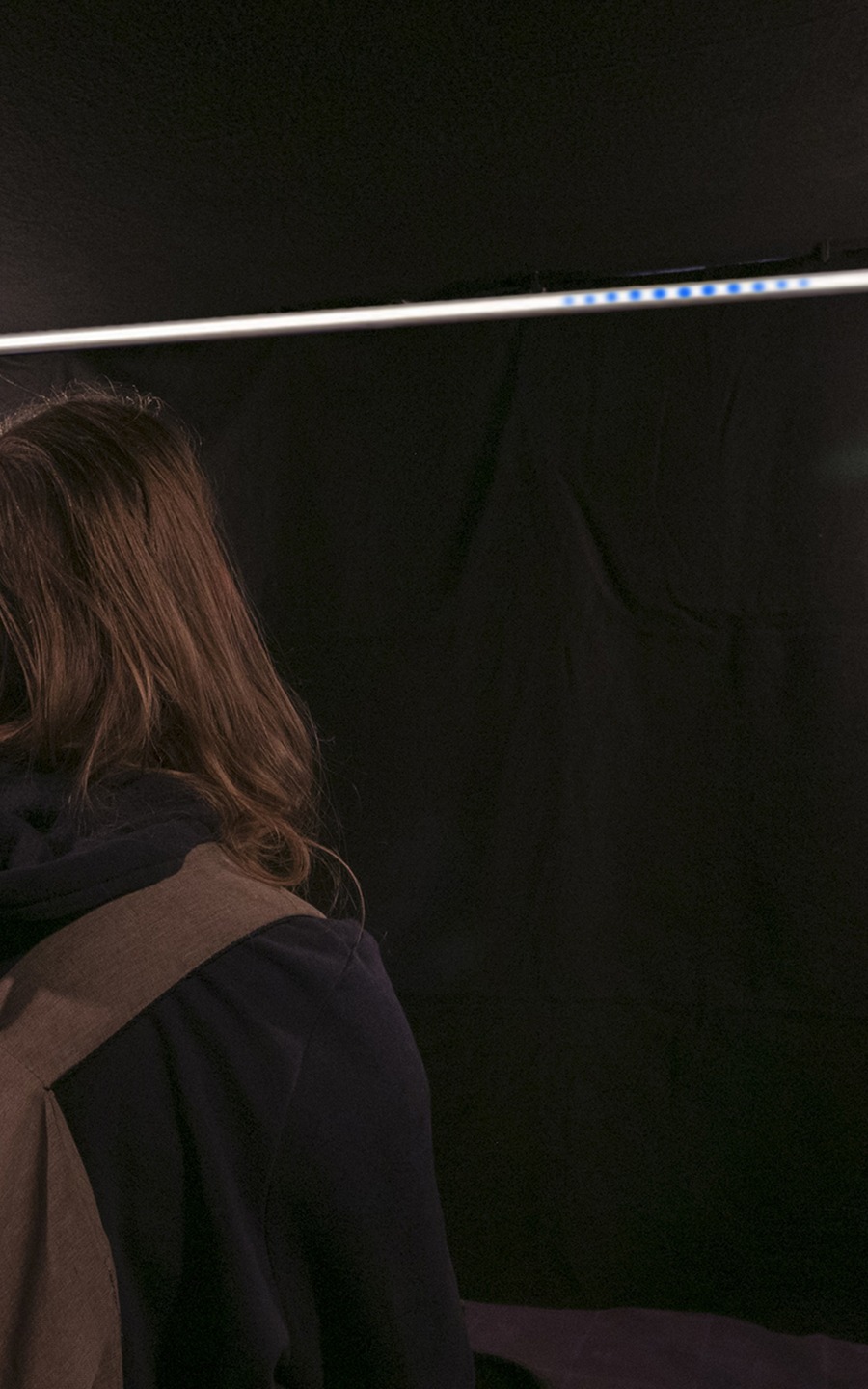
A lightbulb was the main object where the user could talk to. This was the identity of Glowie the chatbot. It changed the intensity of light rapidly and repeatedly to show that Glowie is speaking. 3 LED-strips were giving feedback to the user by showing different patterns during the conversation.
The installation couldn’t perform on its own, so a guide was needed to improve the user experience of the visitors and the user of the chatbot. The main reason of this was that the chatbot has a noticeable delay in its responses, which feels unnatural and makes the user question whether the chatbot works properly. With assistance of a team member, the visitors understood these delays. They became happier and were excited about talking to the chatbot. A rough estimate is that 70% of the visitors of the chatbot enjoyed this experience so much, that they came out with a big smile on their face. The crowd of Glow, who walked by and saw just the motion-designs on the outside of the installation, were surprised by seeing this. They liked seeing the whole installation, but they were distracted by the other light-art installation, in a position above Glowie. The crowd thought it belonged together. Yet, because of our visuals, there were always people waiting in line, with an average waiting time of 20-25 minutes.
To transfer this project to a next team for further development, I've created an Advisory document with a focus what choices are made to form the Glowie installation. The Inventory-list is included.
In this timelapse, which recaps the building up of the whole installation at both events, shows the installation being constructed and the equipment being placed.